RealClimate Climate science commentary by actual climate scientists... 2009-02-19T13:18:47Z WordPress http://www.realclimate.org/index.php/feed/atom/ group http:// <![CDATA[Linking the climate-ecology attribution chain]]> http://www.realclimate.org/index.php/archives/2009/02/linking-the-climate-ecology-attribution-chain/ 2009-02-19T13:18:47Z 2009-02-19T13:18:47Z Guest commentary by Jim Bouldin, Department of Plant Sciences, UC Davis

Linking the regional climate-ecology attribution chain in the western United States

Many are obviously curious about whether certain current regional environmental changes are traceable to global climate change. There are a number of large-scale changes that clearly qualify—rapid warming of the arctic/sub-arctic regions for example, and earlier spring onset in the northern hemisphere and the associated phenological changes in plants and animals. But as one moves to smaller scales of space or time, global-to-local connections become more difficult to establish. This is due to the combined effect of the resolutions of climate models, the intrinsic variability of the system and the empirical climatic, environmental, or ecological data—the signal to noise ratio of possible causes and observed effects. Thus recent work by ecologists, climate scientists, and hydrologists in the western United States relating global climate change, regional climate change, and regional ecological change is of great significance. Together, their results show an increasing ability to link the chain at smaller and presumably more viscerally meaningful and politically tractable scales.

For instance, a couple of weeks ago, a paper in Science by Phil van Mantgem of the USGS, and others, showed that over the last few decades, background levels of tree mortality have been increasing in undisturbed old-growth forests in the western United States, without the accompanying increase in tree “recruitment” (new trees) that would balance the ledger over time. Background mortality is the regular ongoing process of tree death, un-related to the more visible, catastrophic mortality caused by such events as fires, insect attacks, and windstorms, and typically is less than 1% per year. It is that portion of tree death due to the direct and indirect effects of tree competition, climate (often manifest as water stress), and old age. Because many things can affect background mortality, van Mantgem et. al. were very careful to minimize the potential for other possible explanatory variables via their selection of study sites, while still maintaining a relatively long record over a wide geographic area. These other possible causes include, especially, increases in crowding (density; a notorious confounding factor arising from previous disturbances and/or fire suppression), and edge effects (trees close to an
opening experience a generally warmer and drier micro-climate than those in the forest interior).

They found that in each of three regions, the Pacific Northwest, California, and the Interior West, mortality rates have doubled in 17 to 29 years (depending on location), and have been doing so across all dominant species, all size classes, and all elevations. The authors show with downscaled climate information that the increasing mortality rates likely corresponds to summer soil moisture stress increases over that time that are driven by increases in temperature with little or no change in precipitation in these regions. Fortunately, natural background mortality rates in western forests are typically less than 0.5% per year, so rate doublings over ~20-30 years, by themselves, will not have large immediate impacts. What the longer term changes will be is an open question however, depending on future climate and tree recruitment/mortality rates. Nevertheless, the authors have shown clearly that mortality rates have been increasing over the last ~30 years. Thus the $64,000 question: are these changes attributable in part or all to human-induced global warming?

Yes, argues a pair of December papers in the Journal of Climate, and a 2008 work in Science. The studies, by Bonfils et. al. (2008), Pierce et. al. (2008), and Barnett et. al. (2008), link observed western temperature and temperature-induced snowmelt processes to human-forced (greenhouse gases, ozone, and aerosols) global climate changes. The authors used various combinations of three GCMs, two statistical downscaling techniques (to account for micro-climate effects that aren't resolved in the GCMs), and a high resolution hydrology model to experiment with the various possible causes of the observed climatic changes and the robustness of the methods. The possible causes included the usual list of suspects: natural climatic variability, the human-induced forcings just mentioned, and non-human forcings (solar and volcanic). Climate models were chosen specifically for their ability to account for important, natural climatic fluctuations in the western US that influence temperature, precipitation and snowpack dynamics, particularly the Pacific Decadal Oscillation, and El Niño/La Niña oscillations, and/or their ability to generate the daily climatic values necessary for input to the hydrologic model. The relevant climate variables included various subsets of minimum and maximum daily temperatures from January to March (JFM), their corresponding monthly averages, degree days (days with mean T>0ºC), and the ratio of Snow Water Equivalent (SWE) to water year precipitation (P). In each case, multiple hundred year control runs were generated with two GCMs to isolate the natural variability, and then forced runs from previous model intercomparison projects were used to identify the impacts of the various forcings.

The results? The authors estimate that about 50% of the April 1 SWE equivalent, and 60% of river discharge date advances and January-to-March temperature increases, cannot be accounted for by either natural variability or non-human forcings. Bonfils et al also note that the decreases in SWE are due to January-to-March temperature increases, not winter precipitation decreases, as the observational record over the last several decades shows. The April snow is a key variable, for along with spring through early fall temperatures, it has a great bearing on growing season soil moisture status throughout the western United States, and thus directly on forest productivity and demographic processes.

Link o’ chain, meet link o’chain.

]]>
group http:// <![CDATA[Bushfires and extreme heat in south-east Australia]]> http://www.realclimate.org/index.php/archives/2009/02/bushfires-and-climate/ 2009-02-16T20:12:26Z 2009-02-16T20:12:26Z Guest commentary by David Karoly, Professor of Meteorology at the University of Melbourne in Australia

On Saturday 7 February 2009, Australia experienced its worst natural disaster in more than 100 years, when catastrophic bushfires killed more than 200 people and destroyed more than 1800 homes in Victoria, Australia. These fires occurred on a day of unprecedented high temperatures in south-east Australia, part of a heat wave that started 10 days earlier, and a record dry spell.

This has been written from Melbourne, Australia, exactly one week after the fires, just enough time to pause and reflect on this tragedy and the extraordinary weather that led to it. First, I want to express my sincere sympathy to all who have lost family members or friends and all who have suffered through this disaster.

There has been very high global media coverage of this natural disaster and, of course, speculation on the possible role of climate change in these fires. So, did climate change cause these fires? The simple answer is “No!” Climate change did not start the fires. Unfortunately, it appears that one or more of the fires may have been lit by arsonists, others may have started by accident and some may have been started by fallen power lines, lightning or other natural causes.

Maybe there is a different way to phrase that question: In what way, if any, is climate change likely to have affected these bush fires?

To answer that question, we need to look at the history of fires and fire weather over the last hundred years or so. Bushfires are a regular occurrence in south-east Australia, with previous disastrous fires on Ash Wednesday, 16 February 1983, and Black Friday, 13 January 1939, both of which led to significant loss of life and property. Fortunately, a recent report “Bushfire Weather in Southeast Australia: Recent Trends and Projected Climate Change Impacts”(ref. 1) in 2007 provides a comprehensive assessment on this topic. In addition, a Special Climate Statement(ref 2) from the Australian Bureau of Meteorology describes the extraordinary heat wave and drought conditions at the time of the fires.

Following the Black Friday fires, the MacArthur Forest Fire Danger Index (FFDI) was developed in the 1960s as an empirical indicator of weather conditions associated with high and extreme fire danger and the difficulty of fire suppression. The FFDI is the product of terms related to exponentials of maximum temperature, relative humidity, wind speed, and dryness of fuel (measured using a drought factor). Each of these terms is related to environmental factors affecting the severity of bushfire conditions. The formula for FFDI is given in the report on Bushfire Weather in Southeast Australia. The FFDI scale is used for the rating of fire danger and the declaration of total fire ban days in Victoria.

Fire Danger Rating           FFDI range
High                          12 to 25
Very High                     25 to 50
Extreme                         >50

The FFDI scale was developed so that the disastrous Black Friday fires in 1939 had an FFDI of 100.

To understand the environmental conditions associated with the catastrophic bushfires on 7 February 2009, we need to consider each of the factors and the possible role of climate change in them.

Maximum temperature: This is the easiest factor to consider. Melbourne and much of Victoria had record high maximum temperatures on 7 February (2). Melbourne set a new record maximum of 46.4°C, 0.8°C hotter than the previous all-time record on Black Friday 1939 and 3°C higher than the previous February record set on 8 February 1983 (the day of a dramatic dust storm in Melbourne), based on more than 100 years of observations. But maybe the urban heat island in Melbourne has influenced these new records. That may be true for Melbourne, but many other stations in Victoria set new all-time record maximum temperatures on 7 February, including the high-quality rural site of Laverton, near Melbourne, with a new record maximum temperature of 47.5°C, 2.5°C higher than its previous record in 1983. The extreme heat wave on 7 February came after another record-setting heat wave 10 days earlier, with Melbourne experiencing three days in a row with maximum temperatures higher than 43°C during 28-30 January, unprecedented in 154 years of Melbourne observations. A remarkable image of the surface temperature anomalies associated with this heat wave is available from the NASA Earth Observatory.

Increases of mean temperature and mean maximum temperature in Australia have been attributed to anthropogenic climate change, as reported in the IPCC Fourth Assessment, with a best estimate of the anthropogenic contribution to mean maximum temperature increases of about 0.6°C from 1950 to 1999 (Karoly and Braganza, 2005). A recent analysis of observed and modelled extremes in Australia finds a trend to warming of temperature extremes and a significant increase in the duration of heat waves from 1957 to 1999 (Alexander and Arblaster, 2009). Hence, anthropogenic climate change is likely an important contributing factor in the unprecedented maximum temperatures on 7 February 2009.

Relative humidity: Record low values of relative humidity were set in Melbourne and other sites in Victoria on 7 February, with values as low as 5% in the late afternoon. While very long-term high quality records of humidity are not available for Australia, the very low humidity is likely associated with the unprecedented low rainfall since the start of the year in Melbourne and the protracted heat wave. No specific studies have attributed reduced relative humidity in Australia to anthropogenic climate change, but it is consistent with increased temperatures and reduced rainfall, expected due to climate change in southern Australia.

Wind speed: Extreme fire danger events in south-east Australia are associated with very strong northerly winds bringing hot dry air from central Australia. The weather pattern and northerly winds on 7 February were similar to those on Ash Wednesday and Black Friday, and the very high winds do not appear to be exceptional nor related to climate change.

Drought factor: As mentioned above, Melbourne and much of Victoria had received record low rainfall for the start of the year. Melbourne had 35 days with no measurable rain up to 7 February, the second longest period ever with no rain, and the period up to 8 February, with a total of only 2.2 mm was the driest start to the year for Melbourne in more than 150 years (2). This was preceded by 12 years of very much below average rainfall over much of south-east Australia, with record low 12-year rainfall over southern Victoria (2). This contributed to extremely low fuel moisture (3-5%) on 7 February 2009. While south-east Australia is expected to have reduced rainfall and more droughts due to anthropogenic climate change, it is difficult to quantify the relative contributions of natural variability and climate change to the low rainfall at the start of 2009.

Although formal attribution studies quantifying the influence of climate change on the increased likelihood of extreme fire danger in south-east Australia have not yet been undertaken, it is very likely that there has been such an influence. Long-term increases in maximum temperature have been attributed to anthropogenic climate change. In addition, reduced rainfall and low relative humidity are expected in
southern Australia due to anthropogenic climate change. The FFDI for a number of sites in Victoria on 7 February reached unprecedented levels, ranging from 120 to 190, much higher than the fire weather conditions on Black Friday or Ash Wednesday, and well above the “catastrophic” fire danger rating (1).

Of course, the impacts of anthropogenic climate change on bushfires in southeast Australia or elsewhere in the world are not new or unexpected. In 2007, the IPCC Fourth Assessment Report WGII chapter “Australia and New Zealand” concluded

An increase in fire danger in Australia is likely to be associated with a reduced interval between fires, increased fire intensity, a decrease in fire extinguishments and faster fire spread. In south-east Australia, the frequency of very high and extreme fire danger days is likely to rise 4-25% by 2020 and 15-70% by 2050.

Similarly, observed and expected increases in forest fire activity have been linked to climate change in the western US, in Canada and in Spain (Westerling et al, 2006; Gillett et al, 2004; Pausas, 2004). While it is difficult to separate the influences of climate variability, climate change, and changes in fire management strategies on the observed increases in fire activity, it is clear that climate change is increasing the likelihood of environmental conditions associated with extreme fire danger in south-east Australia and a number of other parts of the world.

References and further reading:

(1) Bushfire Weather in Southeast Australia: Recent Trends and Projected Climate Change Impacts, C. Lucas et al, Consultancy Report prepared for the Climate Institute of Australia by the Bushfire CRC and CSIRO, 2007.

(2) Special Climate Statement from the Australian Bureau of Meteorology “The exceptional January-February 2009 heatwave in south-eastern Australia”

Karoly, D. J., and K. Braganza, 2005: Attribution of recent temperature changes in the Australian region. J. Climate, 18, 457-464.

Alexander, L.V., and J. M. Arblaster, 2009: Assessing trends in observed and modelled climate extremes over Australia in relation to future projections. Int. J Climatol., available online.

Hennessy, K., et al., 2007: Australia and New Zealand. Climate Change 2007: Impacts, Adaptation and Vulnerability. Contribution of Working Group II to the Fourth Assessment Report of the Intergovernmental Panel on Climate Change, M.L. Parry, et al., Eds., Cambridge University Press, Cambridge, UK, 507-540.

Westerling, A. L., et al., 2006: Warming and Earlier Spring Increase Western U.S. Forest Wildfire Activity. Science, 313, 940.

Gillett, N. P., et al., 2004: Detecting the effect of climate change on Canadian forest fires. Geophys. Res. Lett., 31, L18211, doi:10.1029/2004GL020876.

Pausas, J. G., 2004: Changes In Fire And Climate In The Eastern Iberian Peninsula (Mediterranean Basin). Climatic Change, 63, 337–350.

]]>
gavin http:// <![CDATA[On replication]]> http://www.realclimate.org/index.php/archives/2009/02/on-replication/langswitch_lang/zh 2009-02-08T12:01:41Z 2009-02-08T12:01:41Z This week has been dominated by questions of replication and of what standards are required to serve the interests of transparency and/or science (not necessarily the same thing). Possibly a recent example of replication would be helpful in showing up some of the real (as opposed to manufactured) issues that arise. The paper I'll discuss is one of mine, but in keeping with our usual stricture against too much pro-domo writing, I won't discuss the substance of the paper (though of course readers are welcome to read it themselves). Instead, I'll focus on the two separate replication efforts I undertook in order to do the analysis. The paper in question is Schmidt (2009, IJoC), and it revisits two papers published in recent years purporting to show that economic activity is contaminating the surface temperature records - specifically de Laat and Maurellis (2006) and McKitrick and Michaels (2007).

Both of these papers were based on analyses of publicly available data - the EDGAR gridded CO2 emissions, UAH MSU-TLT (5.0) and HadCRUT2 in the first paper, UAH MSU-TLT, CRUTEM2v and an eclectic mix of economic indicators in the second. In the first paper (dLM06), no supplementary data were placed online, while the second (MM07) placed the specific data used in the analysis online along with an application-specific script for the calculations. In dLM06 a new method of analysis was presented (though a modification of their earlier work), while MM07 used standard multiple regression techniques. Between them these papers and their replication touch on almost all of the issues raised in recent posts and comments.

Data-as-used vs. pointers to online resources

MM07 posted their data-as-used, and since those data were drawn from dozens of different sources (GDP, Coal use, population etc. as well as temperature), trends calculated and then gridded, recreating this data from scratch would have been difficult to say the least. Thus I relied on their data collation in my own analysis. However, this means that the economic data and their processing were not independently replicated. Depending on what one is looking at this might or might not be an issue (and it wasn't for me).

On the other hand, dLM06 provided no data-as-used, making do with pointers to the online servers for the three principle data sets they used. Unlike for MM07, the preprocessing of their data for their analysis was straightforward - the data were already gridded, and the only required step was regridding to a specific resolution (from 1ºx1º online to 5ºx5º in the analysis). However, since the data used were not archived, the text in the paper had to be relied upon to explain exactly what data were used. It turns out that the EDGAR emissions are disaggregated into multiple source types, and the language in the paper wasn't explicit about precisely which source types were included. This was apparent when the total emissions I came up with differed with the number given in the paper. A quick email to the author resolved the issue since they hadn't included aircraft, shipping or biomass sources in their total. This made sense, and did not affect the calculations materially.

Data updates

In all of the data used, there are ongoing updates to the raw data. For the temperature records, there are variations over time in the processing algorithms (satellites as well as surface stations), for emissions and economic data, updates in reporting or estimation, and in all cases the correction of errors is an ongoing process. Since my interest was in how robust the analyses were, I spent some time reprocessing the updated datasets. This involved downloading the EDGAR3 data, the latest UAH MSU numbers, the latest CRUTEM2/HadCRU2v numbers, and alternative versions of the same (such as the RSS MSU data, HadCRUT3v, GISTEMP). In many cases, these updates are in different formats, have different 'masks' and required specific and unique processing steps. Given the complexity of (and my unfamiliarity with) of economic data, I did not attempt to update that, or even ascertain whether updates had occurred.

In these two papers then, we have two of the main problems often alluded to. It is next-to-impossible to recreate exactly the calculation used in dLM07 since the data sets have changed in the meantime. However, since my scientific interest is in what their analysis says about the real world, any conclusion that was not robust to that level of minor adjustment would not have been interesting. By redoing their calculations with the current data, or with different analyses of analogous data, it is very easy to see that there is no such dependency, and thus reproducing their exact calculation becomes moot. In the MM07 case, it is very difficult for someone coming from the climate side to test the robustness of their analysis to updates in economic data and so that wasn't done. Thus while we have the potential for an exact replication, we are no wiser about its robustness to possibly important factors. I however was able to easily test the robustness of their calculations to changes in the satellite data source (RSS vs. UAH) or to updates in the surface temperature products.

Processing

MM07 used an apparently widespread statistics program called STATA and archived a script for all of their calculations. While this might have been useful for someone familiar with this proprietary software, it is next to useless for someone who doesn't have access to it. STATA scripts are extremely high level, implying they are easy to code and use, but since the underlying code in the routines is not visible or public, they provide no means by which to translate the exact steps taken into a different programming language or environment. However, the calculations mainly consisted of multiple linear regressions which is a standard technique, and so other packages are relatively easily available. I'm an old-school fortran programmer (I know, I know), and so I downloaded a fortran package that appeared to have the same functionality and adapted it to my needs. Someone using Matlab or R could have done something very similar. It was a simple matter to then check that the coefficients from my calculation and that in MM07 were practically the same and that there was a one-to-one match in the nominal significance (which was also calculated differently). This also provides a validation of the STATA routines (which I'm sure everyone was concerned about).

The processing in dLM06 was described plainly in their paper. The idea is to define area masks as a function of the emissions data and calculate the average trend - two methods were presented (averaging over the area then calculating the trend, or calculating the trends and averaging them over the area). With complete data these methods are equivalent, but not quite when there is missing data, though the uncertainties in the trend are more straightforward in the first case. It was pretty easy to code this up myself so I did. Turns out that the method used in dLM07 was not the one they said, but again, having coded both, it is easy to test whether that was important (it isn't).

Replication

Given the data from various sources, my own codes for the processing steps, I did a few test cases to show that I was getting basically the same results in the same circumstances as was reported in the original papers. That worked out fine. Had their been any further issues at this point, I would have sent out a couple of emails, but this was not necessary. Jos de Laat had helpfully replied to two previous questions (concerning what was included in the emissions and the method used for the average trend), and I'm sure he or the other authors involved would have been happy to clarify anything else that might have come up.

Are we done? Not in the least.

Science

Much of the conversation concerning replication often appears to be based on the idea that a large fraction of scientific errors, or incorrect conclusions or problematic results are the result of errors in coding or analysis. The idealised implication being, that if we could just eliminate coding errors, then science would be much more error free. While there are undoubtedly individual cases where this has been the case (this protein folding code for instance), the vast majority of papers that turn out to be wrong, or non-robust are because of incorrect basic assumptions, overestimates of the power of a test, some wishful thinking, or a failure to take account of other important processes (It might be a good idea for someone to tally this in a quantitative way - any ideas for how that might be done?).

In the cases here, the issues that I thought worth exploring from a scientific point of view were not whether the arithmetic was correct, but whether the conclusions drawn from the analyses were. To test that I varied the data sources, the time periods used, the importance of spatial auto-correlation on the effective numbers of degree of freedom, and most importantly, I looked at how these methodologies stacked up in numerical laboratories (GCM model runs) where I knew the answer already. That was the bulk of the work and where all the science lies - the replication of the previous analyses was merely a means to an end. You can read the paper to see how that all worked out (actually even the abstract might be enough).

Bottom line

Despite minor errors in the printed description of what was done and no online code or data, my replication of the dLM07 analysis and it's application to new situations was more thorough than I was able to do with MM07 despite their more complete online materials. Precisely because I recreated the essential tools myself, I was able to explore the sensitivity of the dLM07 results to all of the factors I thought important. While I did replicate the MM07 analysis, the fact that I was dependent on their initial economic data collation means that some potentially important sensitivities did not get explored. In neither case was replication trivial, though neither was it particularly arduous. In both cases there was enough information to scientifically replicate the results despite very different approaches to archiving. I consider that both sets of authors clearly met their responsibilities to the scientific community to have their work be reproducible.

However, the bigger point is that reproducibility of an analysis does not imply correctness of the conclusions. This is something that many scientists clearly appreciate, and probably lies at the bottom of the community's slow uptake of online archiving standards since they mostly aren't necessary for demonstrating scientific robustness (as in these cases for instance). In some sense, it is a good solution to a unimportant problem. For non-scientists, this point of view is not necessarily shared, and there is often an explicit link made between any flaw in a code or description however minor and the dismissal of a result. However, it is not until the "does it matter?" question has been fully answered that any conclusion is warranted. The unsatisfying part of many online replication attempts is that this question is rarely explored.

To conclude? Ease of replicability does not correlate to the quality of the scientific result.

And oh yes, the supplemental data for my paper are available here.

]]>
gavin http:// <![CDATA[Antarctic warming is robust]]> http://www.realclimate.org/index.php/archives/2009/02/antarctic-warming-is-robust/ 2009-02-05T02:56:14Z 2009-02-05T02:56:14Z The difference between a single calculation and a solid paper in the technical literature is vast. A good paper examines a question from multiple angles and find ways to assess the robustness of its conclusions to all sorts of possible sources of error — in input data, in assumptions, and even occasionally in programming. If a conclusion is robust over as much of this as can be tested (and the good peer reviewers generally insist that this be shown), then the paper is likely to last the test of time. Although science proceeds by making use of the work that others have done before, it is not based on the assumption that everything that went before is correct. It is precisely because that there is always the possibility of errors that so much is based on 'balance of evidence' arguments' that are mutually reinforcing.

So it is with the Steig et al paper published last week. Their conclusions that West Antarctica is warming quite strongly and that even Antarctica as a whole is warming since 1957 (the start of systematic measurements) were based on extending the long term manned weather station data (42 stations) using two different methodologies (RegEM and PCA) to interpolate to undersampled regions using correlations from two independent data sources (satellite AVHRR and the Automated Weather Stations (AWS) ), and validations based on subsets of the stations (15 vs 42 of them) etc. The answers in each of these cases are pretty much the same; thus the issues that undoubtedly exist (and that were raised in the paper) — with satellite data only being valid on clear days, with the spottiness of the AWS data, with the fundamental limits of the long term manned weather station data itself - aren't that important to the basic conclusion.

One quick point about the reconstruction methodology. These methods are designed to fill in missing data points using as much information as possible concerning how the existing data at that point connects to the data that exists elsewhere. To give a simple example, if one station gave readings that were always the average of two other stations when it was working, then a good estimate of the value at that station when it wasn't working, would simply be the average of the two other stations. Thus it is always the missing data points that are reconstructed; the process doesn't affect the original input data.

This paper clearly increased the scrutiny of the various Antarctic data sources, and indeed the week, errors were found in the record from the AWS sites 'Harry' (West Antarctica) and 'Racer Rock' (Antarctic Peninsula) stored at the SCAR READER database. (There was a coincidental typo in the listing of Harry's location in Table S2 in the supplemental information to the paper, but a trivial examination of the online resources — or the paper itself, in which Harry is shown in the correct location (Fig. S4b) — would have indicated that this was indeed only a typo). Those errors have now been fixed by the database managers at the British Antarctic Survey.

Naturally, people are interested on what affect these corrections will have on the analysis of the Steig et al paper. But before we get to that, we can think about some 'Bayesian priors'. Specifically, given that the results using the satellite data (the main reconstruction and source of the Nature cover image) were very similar to that using the AWS data, it is highly unlikely that a single station revision will have much of an effect on the conclusions (and clearly none at all on the main reconstruction which didn't use AWS data). Additionally, the quality of the AWS data, particularly any trends, has been frequently questioned. The main issue is that since they are automatic and not manned, individual stations can be buried in snow, drift with the ice, fall over etc. and not be immediately fixed. Thus one of the tests Steig et al. did was a variation of the AWS reconstruction that detrended the AWS data before using them - any trend in the reconstruction would then come solely from the higher quality manned weather stations. The nature of the error in the Harry data record gave an erroneous positive trend, but this wouldn't have affected the trend in the AWS-detrended based reconstruction.

Given all of the above, the Bayesian prior would therefore lean towards the expectation that the data corrections will not have much effect.

The trends in the AWS reconstruction in the paper are shown above. This is for the full period 1957-2006 and the dots are scaled a little smaller than they were in the paper for clarity. The biggest dot (on the Peninsula) represents about 0.5ºC/dec. The difference that you get if you use detrended data is shown next.

As we anticipated, the detrending the Harry data affects the reconstruction at Harry itself (the big blue dot in West Antarctica) reducing the trend there to about 0.2°C/dec, but there is no other significant effect (a couple of stations on the Antarctica Peninsula show small differences). (Note the scale change from the preceding figure — the blue dot represents a change of 0.2ºC/dec).

Now that we know that the trend (and much of the data) at Harry was in fact erroneous, it's useful to see what happens when you don't use Harry at all. The differences with the original results (at each of the other points) are almost undetectable. (Same scale as immediately above; if the scale in the first figure were used, you couldn't see the dots at all!).

In summary, speculation that the erroneous trend at Harry was the basis of the Antarctic temperature trends reported by Steig et al. is completely specious, and could have been dismissed by even a cursory reading of the paper.

However, we are not yet done. There was erroneous input data used in the AWS reconstruction part of the study, and so it's important to know what impact the corrections will have. Eric managed to do some of the preliminary tests on his way to the airport for his Antarctic sojourn and the trend results are as follows:

There is a big difference at Harry of course - a reduction of the trend by about half, and an increase of the trend at Racer Rock (the error there had given an erroneous cooling), but the other points are pretty much unaffected. The differences in the mean trends for Antarctica, or WAIS are very small (around 0.01ºC/decade), and the resulting new reconstruction is actually in slightly better agreement with the satellite-based reconstruction than before (which is pleasing of course).

Bayes wins again! Or should that be Laplace? ;)

Update (6/Feb/09):The corrected AWS-based reconstruction is now available. Note that the main satellite-based reconstruction is unaffected by any issues with the AWS stations since it did not use them.

]]>
david http:// <![CDATA[Irreversible Does Not Mean Unstoppable]]> http://www.realclimate.org/index.php/archives/2009/02/irreversible-does-not-mean-unstoppable/ 2009-02-01T14:50:34Z 2009-02-01T14:50:34Z Susan Solomon, ozone hole luminary and Nobel Prize winning chair of IPCC, and her colleagues, have just published a paper entitled “Irreversible climate change because of carbon dioxide emissions” in the Proceedings of the National Academy of Sciences. We at realclimate have been getting a lot of calls from journalists about this paper, and some of them seem to have gone all doomsday on us. Dennis Avery and Fred Singer used the word Unstoppable as a battle flag a few years ago, over the argument that the observed warming is natural and therefore there is nothing that humanity can do to alter its course. So in terms of its intended rhetorical association, Unstoppable = Burn Baby Burn. But let’s not confuse Irreversible with Unstoppable. One means no turning back, while the other means no slowing down. They are very different words. Despair not!

Solomon et al point out that continued, unabated CO2 emissions to the atmosphere would have climatic consequences that would persist for a thousand years, which they define operationally as “forever”, as in the sense of “Irreversible”. It is not really news scientifically that atmospheric CO2 concentration stays higher than natural for thousands of years after emission of new CO2 to the carbon cycle from fossil fuels. The atmospheric CO2 concentration has a sharp peak toward the end of the fossil fuel era, then after humankind has gone carbon neutral (imagine!) the CO2 concentration starts to subside, quickly at first but after a few centuries settling in a "long tail" which persists for hundreds of thousands of years.

The long tail was first predicted by a carbon cycle model in 1992 by Walker and Kasting. My very first post on realclimate was called “How long will global warming last?”, all about the long tail. Here's a review paper from Climatic Change of carbon cycle models in the literature, which all show the long tail. A number of us “long tailers” got together (electronically) to do a Long Tail Model Intercomparison Project, LTMIP, just like the big guys PMIP and OCMIP (preliminary results of LTMIP to be appearing soon in Annual Reviews of Earth and Planetary Sciences). I even wrote you guys a book on the topic.

The actual carbon-containing molecules from the fossil fuel spread out into the other carbon reservoirs in the fast parts of the carbon cycle, dissolving in the oceans and getting snapped up by photosynthetic land plants. The spreading of the carbon is analogous to water poured into one part of a lake, it quickly spreads out into the rest of the lake, rather than remaining in a pile where you poured it, and the lake level rises a bit everywhere. In the carbon cycle, translated out of this tortured analogy, the atmospheric carbon dioxide content rises along with the contents of the other carbon reservoirs.

Ultimately the airborne fraction of a CO2 release is determined largely by the buffer chemistry of the ocean, and you can get a pretty good answer with a simple calculation based on a well-mixed ocean, ignoring all the complicated stuff like temperature differences, circulation, and biology. The ocean decides that the airborne fraction of a CO2 release, after it spreads out into the other fast parts of the carbon cycle, will be in the neighborhood of 10-30%. The only long-term way to accelerate the CO2 drawdown in the long tail would be to actively remove CO2 from the air, which I personally believe will ultimately be necessary. But the buffering effect of the ocean would work against us here, releasing CO2 to compensate for our efforts.

As a result of the long tail, any climate impact from more CO2 in the air will be essentially irreversible. Then the question is, what are the climate impacts of CO2? It gets warmer, that’s pretty clear, and sea level rises. Sea level rise is a profound consequence of the long tail of global warming because the response in the past, over geologic time scales, is tens of meters per °C change in global mean temperature, about 100 times stronger than the IPCC forecast for 2100 (about 0.2 meters per °C). The third impact which gains immortality from the long tail is precipitation. Here the conventional story has been that climate models are not very consistent in the regional precipitation changes they predict in response to rising CO2. Apparently this is changing with the AR4 suite of model runs, as Solomon et al demonstrated in their Figure 3. Also, there is a consistent picture of drought impact with warming in some places, for example the American Southwest, both over the past few decades and in medieval time. The specifics of a global warming drought forecast are beginning to come into focus.

Perhaps the despair we heard in our interviewers’ questions arose from the observation in the paper that the temperature will continue to rise, even if CO2 emissions are stopped today. But you have to remember that the climate changes so far, both observed and committed to, are minor compared with the business-as-usual forecast for the end of the century. It’s further emissions we need to worry about. Climate change is like a ratchet, which we wind up by releasing CO2. Once we turn the crank, there's no easy turning back to the natural climate. But we can still decide to stop turning the crank, and the sooner the better.

Walker JCG, Kasting JF. 1992. Effects of fuel and forest conservation on future levels of atmospheric carbon dioxide. Palaeogeogr. Palaeoclimatol. Palaeoecol. (Glob. Planet. Change Sect.) 97:151–89

]]>
group http:// <![CDATA[A global glacier index update]]> http://www.realclimate.org/index.php/archives/2009/01/a-global-glacier-index-update/ 2009-01-31T13:59:31Z 2009-01-31T13:59:31Z Guest commentary by Mauri Pelto

For global temperature time series we have GISTEMP, NCDC and HadCRUT. Each has worked hard to assimilate global temperature data into reliable and accurate indices of global temperature. The equivalent for alpine glaciers is the World Glacier Monitoring Service’s (WGMS) record of mass balance and terminus behavior. Beginning in 1986, WGMS began to maintain and publish the collection of information on ongoing glacier changes that had begun in 1960 with the Permanent Service on Fluctuations of glaciers. This program in the last 10 years has striven to acquire, publish and verify glacier terminus and mass balance measurement data from alpine glaciers the world over on a timely basis. Spearheaded by Wlfried Haeberli with assistance from Isabelle Roer, Michael Zemp, Martin Hoelzle, at the University of Zurich, their efforts have resulted in the recent publication, “Global Glacier Changes: facts and figures” published jointly with UNEP. This publication summarizes the information collected and submitted by the national correspondents of WGMS portraying the global response of glaciers to climate change, as well as the regional response.

The health of an alpine glacier is typically determined by monitoring the behavior of the terminus and/or its mass balance. Glacier mass balance is the difference between accumulation and ablation (melting and sublimation) and can be altered by climate change caused variations in temperature and snowfall. A glacier with a sustained negative balance is out of equilibrium and will retreat. A glacier with sustained positive balance is out of equilibrium, and will advance to reestablish equilibrium. Glacier advance increases the area of a glacier at lower elevations where ablation is highest, offsetting the increase in accumulation. Glacier retreat results in the loss of the low-elevation region of the glacier. Since higher elevations are cooler, the disappearance of the lowest portion of the glacier reduces total ablation, increasing mass balance and potentially reestablishing equilibrium. If a glacier lacks a consistent accumulation it is in disequilibrium (non-steady state) with climate and will retreat away without a climate change toward cooler wetter conditions (Pelto, 2006; Paul
et al., 2007
).

In terms of mass balance two charts indicate the mean annual balance of the WGMS reporting glaciers and the mean cumulative balance of reporting glaciers with more than 30-years of record and of all reporting glaciers. The trends demonstrates why alpine glaciers are currently retreating, mass balances have been significantly and consistently negative. Mass balance is reported in water equivalent thickness changes. A loss of 0.9 m of water equivalent is the same as the loss of 1.0 m of glacier thickness, since ice is less dense than water. The cumulative loss of the last 30 years is the equivalent of cutting a thick slice off of the average glacier. The trend is remarkably consistent from region to region. The figure on the right is the annual glacier mass balance index from the WGMS (if this was business it would be bankrupt by now). The cumulative mass balance index, based on 30 glaciers with 30 years of record and for all glaciers is not appreciably different (the dashed line for subset of 30 reference glaciers, is because not all 30 glaciers have submitted final data for the last few years):

Nor is the graph much different for North America Glaciers individually or collectively. The next figure shows the cumulative annual balance of North American Glaciers reporting to the WGMS with at least 15 years of recor:

The second parameter reported by WGMS is terminus behavior. The values are generally for glaciers examined annually (many additional glaciers are examined periodically). The population has an over-emphasis on glaciers from the European Alps, but the overall global and regional records are very similar, with the exception of New Zealand. The number of advancing versus retreating glaciers in the diagram below from the WGMS shows a 2005 minimum in the percentage of advancing glaciers in Europe, Asia and North America and Europe. In Asia and Alaska, there have been extensive terminus surveys illustrating long term retreat using satellite image and aerial photographic comparison over longer time spans. Those results indicate that 95% of the glaciers are retreating, but are not fully reflected in the annual terminus retreat data base of the WGMS. In 2005 there were 442 glaciers examined, 26 advancing, 18 stationary and 398 retreating - implying that "only" 90% are retreating. In 2005, for the first time ever, no observed Swiss glaciers advanced. Of the 26 advancing glaciers, 15 were in New Zealand. Overall there has been a substantial volume loss of 11% of New Zealand glaciers from 1975-2005 Salinger et al. ,but the number of advancing glacier is still significant.

That glaciers are shrinking in terms of volume (mass balance) and length (terminus behavior) is not news. What is news is the development of a robust global index of glacier behavior. As a submitter of data to WGMS, I can report that the scrutiny and level of detail requested of the submitted of data is increasing. The degree of participation by glaciologic programs is also increasing. Both are important and will lead to an even better glacier index in the future, with more even representation from around the globe.

]]>
gavin http:// <![CDATA[Warm reception to Antarctic warming story]]> http://www.realclimate.org/index.php/archives/2009/01/warm-reception-to-antarctic-warming-story/ 2009-01-28T04:15:33Z 2009-01-28T04:15:33Z What determines how much coverage a climate study gets?

It probably goes without saying that it isn't strongly related to the quality of the actual science, nor to the clarity of the writing. Appearing in one of the top journals does help (Nature, Science, PNAS and occasionally GRL), though that in itself is no guarantee. Instead, it most often depends on the 'news' value of the bottom line. Journalists and editors like stories that surprise, that give something 'new' to the subject and are therefore likely to be interesting enough to readers to make them read past the headline. It particularly helps if a new study runs counter to some generally perceived notion (whether that is rooted in fact or not). In such cases, the 'news peg' is clear.

And so it was for the Steig et al "Antarctic warming" study that appeared last week. Mainstream media coverage was widespread and generally did a good job of covering the essentials. The most prevalent peg was the fact that the study appeared to reverse the "Antarctic cooling" meme that has been a staple of disinformation efforts for a while now.

It's worth remembering where that idea actually came from. Back in 2001, Peter Doran and colleagues wrote a paper about the Dry Valleys long term ecosystem responses to climate change, in which they had a section discussing temperature trends over the previous couple of decades (not the 50 years time scale being discussed this week). The "Antarctic cooling" was in their title and (unsurprisingly) dominated the media coverage of their paper as a counterpoint to "global warming". (By the way, this is a great example to indicate that the biggest bias in the media is towards news, not any particular side of a story). Subsequent work indicated that the polar ozone hole (starting in the early 80s) was having an effect on polar winds and temperature patterns (Thompson and Solomon, 2002; Shindell and Schmidt, 2004), showing clearly that regional climate changes can sometimes be decoupled from the global picture. However, even then both the extent of any cooling and the longer term picture were more difficult to discern due to the sparse nature of the observations in the continental interior. In fact we discussed this way back in one of the first posts on RealClimate back in 2004.

This ambiguity was of course a gift to the propagandists. Thus for years the Doran et al study was trotted out whenever global warming was being questioned. It was of course a classic 'cherry pick' - find a region or time period when there is a cooling trend and imply that this contradicts warming trends on global scales over longer time periods. Given a complex dynamic system, such periods and regions will always be found, and so as a tactic it can always be relied on. However, judging from the take-no-prisoners response to the Steig et al paper from the contrarians, this important fact seems to have been forgotten (hey guys, don't worry you'll come up with something new soon!).

Actually, some of the pushback has been hilarious. It's been a great example for showing how incoherent and opportunistic the 'antis' really are. Exhibit A is an email (and blog post) sent out by Senator Inhofe's press staff (i.e. Marc Morano). Within this single email there are misrepresentations, untruths, unashamedly contradictory claims and a couple of absolutely classic quotes. Some highlights:

Dr. John Christy of the University of Alabama in Huntsville slams new Antarctic study for using [the] “best estimate of the continent's temperature”

Perhaps he'd prefer it if they used the worst estimate? ;)
[Update: It should go without saying that this is simply Morano making up stuff and doesn't reflect Christy's actual quotes or thinking. No-one is safe from Morano's misrepresentations!]
[Further update: They've now clarified it. Sigh….]

Morano has his ear to the ground of course, and in his blog piece dramatically highlights the words "estimated" and "deduced" as if that was some sign of nefarious purpose, rather than a fundamental component of scientific investigation.

Internal contradictions are par for the course. Morano has previously been convinced that "… the vast majority of Antarctica has cooled over the past 50 years.", yet he now approvingly quotes Kevin Trenberth who says "It is hard to make data where none exist.” (It is indeed, which is why you need to combine as much data as you can find in order to produce a synthesis like this study). So which is it? If you think the data are clear enough to demonstrate strong cooling, you can't also believe there is no data (on this side of the looking glass anyway).

It's even more humourous, since even the more limited analysis available before this paper showed pretty much the same amount of Antarctic warming. Compare the IPCC report, with the same values from the new analysis (under various assumptions about the methodology).

(The different versions are the full reconstruction, a version that uses detrended satellite data for the co-variance, a version that uses AWS data instead of satelltes and one that use PCA instead of RegEM. All show positive trends over the last 50 years).

Further contradictions abound: Morano, who clearly wants it to have been cooling, hedges his bets with a "Volcano, Not Global Warming Effects, May be Melting an Antarctic Glacier" Hail Mary pass. Good luck with that!

It always helps if you haven't actually read the study in question. That way you can just make up conclusions:

Scientist adjusts data — presto, Antarctic cooling disappears

Nope. It's still there (as anyone reading the paper will see) - it's just put into a larger scale and longer term context (see figure 3b).

Inappropriate personalisation is always good fodder. Many contrarians seemed disappointed that Mike was only the fourth author (the study would have been much easier to demonise if he'd been the lead). Some pretended he was anyway, and just for good measure accused him of being a 'modeller' as well (heaven forbid!).

Others also got in on the fun. A chap called Ross Hays posted a letter to Eric on multiple websites and on many comment threads. On Joe D'Aleo's site, this letter was accompanied with this little bit of snark:

Icecap Note: Ross shown here with Antarctica’s Mount Erebus volcano in the background was a CNN forecast Meteorologist (a student of mine when I was a professor) who has spent numerous years with boots on the ground working for NASA in Antarctica, not sitting at a computer in an ivory tower in Pennsylvania or Washington State

This is meant as a slur against academics of course, but is particularly ironic, since the authors of the paper have collectively spent over 8 seasons on the ice in Antarctica, 6 seasons in Greenland and one on Baffin Island in support of multiple ice coring and climate measurement projects. Hays' one or two summers there, his personal anecdotes and misreadings of the temperature record, don't really cut it.

Neither do rather lame attempts to link these results with the evils of "computer modelling". According to Booker (for it is he!) because a data analysis uses a computer, it must be a computer model - and probably the same one that the "hockey stick" was based on. Bad computer, bad!

The proprietor of the recently named "Best Science Blog", also had a couple of choice comments:

In my opinion, this press release and subsequent media interviews were done for media attention.

This remarkable conclusion is followed by some conspiratorial gossip implying that a paper that was submitted over a year ago was deliberately timed to coincide with a speech in Congress from Al Gore that was announced last week. Gosh these scientists are good.

All in all, the critical commentary about this paper has been remarkably weak. Time will tell of course - confirming studies from ice cores and independent analyses are already published, with more rumoured to be on their way. In the meantime, floating ice shelves in the region continue to collapse (the Wilkins will be the tenth in the last decade or so) - each of them with their own unique volcano no doubt - and gravity measurements continue to show net ice loss over the Western part of the ice sheet.

Nonetheless, the loss of the Antarctic cooling meme is clearly bothering the contrarians much more than the loss of 10,000 year old ice. The poor level of their response is not surprising, but it does exemplify the tactics of the whole 'bury ones head in the sand" movement - they'd much rather make noise than actually work out what is happening. It would be nice if this demonstration of intellectual bankruptcy got some media attention itself.

That's unlikely though. It's just not news.

]]>
stefan http:// <![CDATA[Sea will rise ‘to levels of last Ice Age’]]> http://www.realclimate.org/index.php/archives/2009/01/sea-will-rise-to-levels-of-last-ice-age/langswitch_lang/in 2009-01-26T15:19:40Z 2009-01-26T15:19:40Z cogee beachThe British tabloid Daily Mirror recently headlined that “Sea will rise 'to levels of last Ice Age'”. No doubt many of our readers will appreciate just how scary this prospect is: sea level during the last Ice Age was up to 120 meters lower than today. Our favourite swimming beaches – be it Coogee in Sydney or the Darß on the German Baltic coast – would then all be high and dry, and ports like Rotterdam or Tokyo would be far from the sea. Imagine it.

But looking beyond the silly headline (another routine case of careless science reporting), what was the real story behind it? The Mirror article (like many others) was referring to a new paper by Grinsted, Moore and Jevrejeva published in Climate Dynamics (see paper and media materials). The authors conclude there that by 2100, global sea level could rise between 0.7 and 1.1 meters for the B1 emission scenario, or 1.1 to 1.6 meters for the A1FI scenario.

The method by which they derive these estimates is based on a semi-empirical formula connecting global sea level to global temperature, fitted to observed data. It assumes that after a change in global temperature, sea level will exponentially approach a new equilibrium level with a time scale τ. This extends the semi-empirical method I proposed in Science in 2007. I assumed that past data will tell us the initial rate of rise (and this initial rate is useful for projections if the time scale τ is long compared to the time horizon one is interested in). The new paper tries to obtain both the time scale τ and the final equilibrium sea level change by fitting to past data.

Therefore, my approach is a special case of Grinsted's more general model, as you can see by inserting their Eq. (1) into (2): namely the special case for long response times (τ >> 100 years or so). Hence it is reassuring and a nice confirmation that they get the same result as me for their "Historical" case (where they get τ=1200 years) as well as their τ=infinite calculations, despite using a different sea level data set (going back to 1850, where I used the Church&White 2006 data that start in 1880) and a more elaborate statistical analysis.

However, I find their determination of τ is on rather shaky ground since the data sets used are too short to determine such a long time scale with any confidence. That their statistics suggest otherwise cannot be right - you can tell by the fact that they get contradictory results for different data sets (e.g., 1200 +/- 500 years for the "Historical" case and 210 +/- 70 years for the "Moberg" case). Both can’t be correct, so the narrow uncertainty ranges are likely an underestimate of the uncertainty.

The problem gets even more apparent when looking at the equilibrium sea level resulting from their data fit. From paleoclimatic data (see Figure) we expect that per degree of temperature change, the final equilibrium sea level change is somewhere between 10 and 30 meters (as I argue in my Science paper – this was my basis for assuming τ must be very long). Grinsted et al. find from their data fit that this is only 1.3 +/- 0.4 meters (for the Moberg case, which they call the most likely) - see Figure. This means that getting the sea level lowering of ~120 meters that is well-established for the Last Glacial Maximum would have required a global cooling of about 90 ºC according to their model. And for the future, the model would predict that melting all ice in Greenland and Antarctica (resulting in 65 meters of sea level rise) would require about 50 ºC of global warming. This lack of realism matters, since it is directly linked to the short τ: the observed sea level rise of the past century or so can either be fitted by a short τ and a small equilibrium rise, or by a long τ and a large equlibrium rise (per degree). I consider the latter case the realistic one.


Global mean temperature and sea level (relative to today’s) at different times in Earth’s history, together with the projection for the year 2100 (which is not an equilibrium change!). The red line shows the "most likely" equilibrium response according to Grinsted et al. [Modified after Archer (2006) and WBGU 2006; see p. 33 there for references and discussion.]

Grinsted et al. did apply some paleoclimatic data constraints, but they are based on a misunderstanding of these data. They assume (their constraint 3) that the last interglacial was globally 3-5 ºC warmer than present – however the reference cited in support (the IPCC paleoclimate chapter, of which I am a co-author) explains that these are Arctic summer temperatures. This Arctic summer warming is due to orbital changes which cause cooling elsewhere on the planet, resulting in global mean changes that are very small (see e.g. Kubatzki et al. 2000). Grinsted et al make the same mistake for glacial climate (their constraint 4), where they assume glacial maximum temperatures were globally 17 ºC below present – the reference cited states already in the abstract that this only applies to the latitude band 40-80ºN. Glacial cooling was highly non-uniform, with global mean cooling estimated as 4-7ºC (see Schneider et al. 2006, “How cold was the Last Glacial Maximum?”) These misguided paleo-constraints lead Grinsted et al. to limit equilibrium sea level rise to a fraction of what the data points show in the Figure above, and this rules out a good data fit for long time scales τ.

For these reasons I am unconvinced by the short τ found (or assumed) by Grinsted et al. which is the key difference to my earlier study, and I would still maintain that assuming the equilibration time to be very long is a more robust assumption. Note that (unlike Grinsted et al.) this does not assume that the approach to equilibrium is exponential with a single time scale, which in itself is doubtful given the different processes involved. It only assumes that the initial rate of rise scales with temperature and is relevant on time scales of interest. On the positive side, Grinsted et al. have shown that the data fit and projected sea level rise for the case of large τ is robust with respect to the chosen statistical method and data set.

Refinements of the semi-empirical approach are welcome - I had hoped that my paper would stimulate further work in this direction. While empirical approaches will not give us definitive answers about future sea level since the past can never be a perfect analogue of the future, these analyses can still be useful to give us a better feeling for how the sea level responded in the past and what that might imply for what lies ahead. But one thing is certain: I'm not too worried that sea level might drop to glacial levels during this century.

]]>
rasmus http://ocg.met.no/OCG_Benestad.htm <![CDATA[Reindeer herding, indigenous people and climate change]]> http://www.realclimate.org/index.php/archives/2009/01/reindeer-herding-indigenous-people-and-climate-change/langswitch_lang/in 2009-01-24T10:40:08Z 2009-01-24T10:40:08Z Lavo The Sámi are keenly aware about climate change, and are thus concerned about their future. Hence, the existence of the International Polar Year (IPY) project called EALÁT involving scientists, Sámi from Norway/Sweden/Finland, as well as Nenets from Russia. The indigenous people in the Arctic are closely tuned to the weather and the climate. I was told that the Sámi have about 300 words for snow, each with a very precise meaning.

It is important get a fusion of traditional knowledge and modern science and adopt a holistic approach. The indigenous people often have a different world view, in addition to having invaluable knowledge and experience about nature. Furthermore, if the end results are to be of any value beyond academic, then the stakeholders must be involved on equal terms. For instance, remote sensing data from NASA - for better understanding of land-vegetation - can be combined with traditional knowledge through the use of geographical information system (GIS).

The big challenge facing reindeer herding peoples in the Arctic is the ability to adapt to a climate change, according to a recent EALÁT workshop that was held in Guovdageaidnu (Kautokeino), with representatives from the US, Russia, Sweden, Finland as well as Norway.

In Russia, however, climate change was not perceived as the major concern, according to the reports from the work shop, but rather industrial development constraining their use of land. Climate change should nevertheless be a concern.

The traditional adaption strategy amongst the nomadic indigenous people have involved a migration and moving the reindeer herd from one pasture to another, when exposed to climatic fluctuations. In addition, they aim to keep a well-balanced and robust herd structure. But today there are more severe land constraints, such as obstructing infrastructure, fences, and national borders, limiting the ability to move to regions where the grazing is good. Furthermore, projections for the Arctic suggest changes well beyond the range of observed variability.

The reindeer herds are affected by climatic swings, particularly when hard icy layers are formed on snow (or within the snow layer) making the food underneath unreachable. Warm summers may also cause problems, and insects (pests), forest fires, and the melting of permafrost can be additional stress factors.

]]>
eric http://faculty.washington.edu/steig <![CDATA[State of Antarctica: red or blue?]]> http://www.realclimate.org/index.php/archives/2009/01/state-of-antarctica-red-or-blue/langswitch_lang/in 2009-01-21T18:10:21Z 2009-01-21T18:10:21Z A couple of us (Eric and Mike) are co-authors on a paper coming out in Nature this week (Jan. 22, 09). We have already seen misleading interpretations of our results in the popular press and the blogosphere, and so we thought we would nip such speculation in the bud.

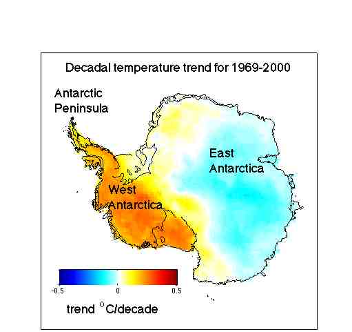
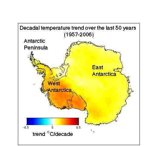
The paper shows that Antarctica has been warming for the last 50 years, and that it has been warming especially in West Antarctica (see the figure). The results are based on a statistical blending of satellite data and temperature data from weather stations. The results don't depend on the statistics alone. They are backed up by independent data from automatic weather stations, as shown in our paper as well as in updated work by Bromwich, Monaghan and others (see their AGU abstract, here), whose earlier work in JGR was taken as contradicting ours. There is also a paper in press in Climate Dynamics (Goosse et al.) that uses a GCM with data assimilation (and without the satellite data we use) and gets the same result. Furthermore, speculation that our results somehow simply reflect changes in the near-surface inversion is ruled out by completely independent results showing that significant warming in West Antarctica extends well into the troposphere. And finally, our results have already been validated by borehole thermometery — a completely independent method — at at least one site in West Antarctica (Barrett et al. report the same rate of warming as we do, but going back to 1930 rather than 1957; see the paper in press in GRL).

Here are some important things the paper does NOT show:

1) Our results do not contradict earlier studies suggesting that some regions of Antarctica have cooled. Why? Because those studies were based on shorter records (20-30 years, not 50 years) and because the cooling is limited to the East Antarctic. Our results show this too, as is readily apparent by comparing our results for the full 50 years (1957-2006) with those for 1969-2000 (the dates used in various previous studies), below.

2) Our results do not necessarily contradict the generally-accepted interpretation of recent East Antarctic cooling put forth by David Thompson (Colorado State) and Susan Solomon (NOAA Aeronomy Lab). In an important paper in Science, they presented evidence that this cooling trend is linked to an increasing trend in the strength of the circumpolar westerlies, and that this can be traced to changes in the stratosphere, mostly due to photochemical ozone losses. Substantial ozone losses did not occur until the late 1970s, and it is only after this period that significant cooling begins in East Antarctica.

3) Our paper — by itself — does not address whether Antarctica's recent warming is part of a longer term trend. There is separate evidence from ice cores that Antarctica has been warming for most of the 20th century, but this is complicated by the strong influence of El Niño events in West Antarctica. In our own published work to date (Schneider and Steig, PNAS), we find that the 1940s [edit for clarity: the 1935-1945 decade] were the warmest decade of the 20th century in West Antarctica, due to an exceptionally large warming of the tropical Pacific at that time.

So what do our results show? Essentially, that the big picture of Antarctic climate change in the latter part of the 20th century has been largely overlooked. It is well known that it has been warming on the Antarctic Peninsula, probably for the last 100 years (measurements begin at the sub-Antarctic Island of Orcadas in 1901 and show a nearly monotonic warming trend). And yes, East Antarctica cooled over the 1980s and 1990s (though not, in our results, at a statistically significant rate). But West Antarctica, which no one really has paid much attention to (as far as temperature changes are concerned), has been warming rapidly for at least the last 50 years.

Why West Antarctica is warming is just beginning to be explored, but in our paper we argue that it basically has to do enhanced meridional flow — there is more warm air reaching West Antarctica from farther north (that is, from warmer, lower latitudes). In the parlance of statistical climatology, the "zonal wave 3 pattern" has increased (see Raphael, GRL 2004). Something that goes along with this change in atmospheric circulation is reduced sea ice in the region (while sea ice in Antarctica has been increasing on average, there have been significant declines off the West Antarctic coast for the last 25 years, and probably longer). And in fact this is self reinforcing (less sea ice, warmer water, rising air, lower pressure, enhanced storminess).

The obvious question, of course, is whether those changes in circulation are themselves simply "natural variability" or whether they are forced — that is, resulting from changes in greenhouse gases. There will no doubt be a flurry of papers that follow ours, to address that very question. A recent paper in Nature Geosciences by Gillet et al. examined trends in temperatures in the both Antarctic and the Arctic, and concluded that "temperature changes in both … regions can be attributed to human activity." Unfortunately our results weren't available in time to be made use of in that paper. But we suspect it will be straightforward to do an update of that work that does incorporate our results, and we look forward to seeing that happen.


Postscript
Some comment is warranted on whether our results have bearing on the various model projections of future climate change. As we discuss in the paper, fully-coupled ocean-atmosphere models don't tend to agree with one another very well in the Antarctic. They all show an overall warming trend, but they differ significantly in the spatial structure. As nicely summarized in a paper by Connolley and Bracegirdle in GRL, the models also vary greatly in their sea ice distributions, and this is clearly related to the temperature distributions. These differences aren't necessarily because there is anything wrong with the model physics (though schemes for handling sea ice do vary quite a bit model to model, and certainly are better in some models than in others), but rather because small differences in the wind fields between models results in quite large differences in the sea ice and air temperature patterns. That means that a sensible projection of future Antarctic temperature change — at anything smaller than the continental scale — can only be based on looking at the mean and variation of ensemble runs, and/or the averages of many models. As it happens, the average of the 19 models in AR4 is similar to our results — showing significant warming in West Antarctica over the last several decades (see Connolley and Bracegirdle's Figure 1).

]]>