Fri, 31 October 2008
 Before special edition DVDs and devoted internet fan sites there was pretty much only one great place to find out about all the fun little tidbits and facts on your favorite films, the souvenir film magazine. Well, they weren't really the only place for info (there were plenty of other magazines, newspapers and books helping to cover the ins and outs of film), but they sure were a good place to find out a lot about a particular movie. Of course you were limited to only the films that were deemed important enough to have a souvenir magazine, flicks like Rambo: First Blood Part II, the Karate Kid, Back to the Future, and presented today, Gremlins...  Growing up in the 80s I bought, read and re-read the magazines released for the Karate Kid (and it’s sequel), Willow, and Tim Burton's Batman. Though I was just as obsessed with Gremlins, I never came across the magazine (though I did have an over-sized hardback story book, a book and record set, and a few smaller floppy storybooks that were illustrated instead of featuring film stills.) When I came upon this copy in a used bookstore recently I couldn't help but pick it up. These magazines were great, usually featuring a ton of film stills, interviews and peeks behind the scenes. This particular issue features a ton of storyboards, a poster and a lot of behind the scenes trivia…    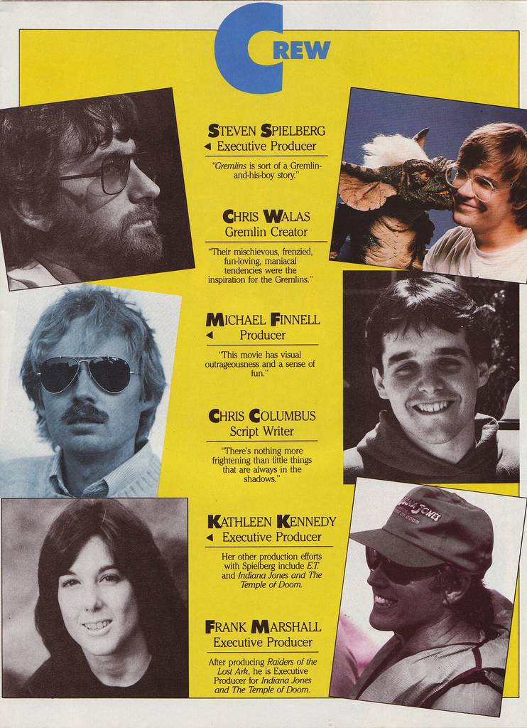    I used to cover my walls with this sort of pull-out poster. In fact when I turned 10 and became a hardcore Metallica devote, I cut out every single picture in the special Metal Edge Metallica souvenir magazine (even went so far as to but two copies so I could get the pictures from both sides of the pages) and cover one entire wall with clippings. What's weird is that the older I got the more I felt like I needed to grow out of this trend, growing into only hanging full-sized movie posters and such. Now I don;t even hang posters anymore. I guess I'm sort of a fuddy duddy that way...  This issue also featured a fun ad for Don Post Gremlins Halloween masks (available in regular and deluxe furry editions!)  Category:Halloween 2008
-- posted at: 12:37 AM Comments[5]
|
Wed, 29 October 2008
When I was out earlier in the year scrounging around for content for the 2008 Halloween Countdown, I never thought I'd find a cool little book that picked up the torch of the Crestwood Monster series (which I've written about both here, and here, as well as in the 1st issue of the Branded in the 80s magazine available for purchase here) in the early 90s, but I did. While I was browsing the ever awesome Bizarro Wuxtry in Athens, GA (kept up by the ever kind and knowledgeable Devlin Thompson) I spied a little baby blue paperback at the back of a glass case filled with all sorts of monster related goodness from the past 30 odd years. What immediately caught my eye was the marker attached to the cover which could mean only one thing (that this was some form of the invisible ink books that I grew up loving, having picked up a million and one Yes & Know books on family vacations over the years.) This was a great find though being monster themed and all and was called the Mark and See Universal Studio Monsters Frightening Facts book (circa 1992…)  First things first, I was so jazzed that the back cover was a perfect copy of the front cover, even including an image of the attached marker, as there was no way I was going to get a good scan of the cover (since the marker bulged out so far.) Anyway, when I first picked up the book and headed home I assumed that it was just a Universal Monster themed Yes & Know book, but when I got home and really took a good look at it I was floored. Crammed into its 48 pages is a wealth of material on all of the Universal monster movies and their source material that this one book contains almost the entire Crestwood Monster Series…  There are sections devoted to Frankenstein, Dracula, the Wolfman, the Mummy, and the Creature from the Black Lagoon that feature one page Cliff's Notes versions of the main films, as well as background on the characters and some fun facts on the films…  Though a lot of the interior artwork is re-purposed from the 90s Universal Monster campaign (as seen in the top left of the cover), there are also a lot of nice full page stills from the movies…  Most surprising of all was that the invisible ink marker still works, even after sitting on various store shelves for the last 16 years. Now that's quality!    The book also features four detachable monster trading cards with some nifty airbrushed artwork. Snazzy!   Stuff like this really warms my heart as I'll always be a fan of the Universal monsters films first and foremost, and (probably pointlessly) I fear that as the years go on and the films get older and lose some of their relevance to the current generation that more and more kids aren't going to get introduced to them. Crestwood was there for me as a kid, and Universal themselves were picking up the slack in the 90s, but what about kids today? What books are out there turning pre-teens into Franky Fans? Category:Halloween 2008
-- posted at: 11:28 PM Comments[0]
|
Tue, 28 October 2008
New Halloween candy has really been a mixed bag this year. Overall I was pretty disappointed with the crop, but I have to admit that there were some pretty crazy concepts and designs floating about. There were some really fun repackaging designs as in the Halloween Nerds that popped up way back in early August…  I mean as Nerds candy goes, it's kind of hard to find new ways to market it outside of pretending that the little candy coated grains of sugar are edible aquarium pebbles. So when Wonka put 'em in plastic test tubes with monster shaped stoppers and called them antidotes, vaccines, makeovers, and morphs, it was pretty ingenious. In essence I'm getting a little plastic monster toy, candy, and imagination fodder for pretending that the only thing keeping me from sprouting fangs and draining my wife of her life blood is the test tube of candy that is just outside my reach! Seriously though, these were a great way of getting me excited about a candy that I've known and loved for years. It also doesn't hurt that the werewolf figure/stopper bears an uncanny resemblance to A.L.F.!  In that same vein (oh ho, what a bad pun), we have Confectionery Lane's Halloween contribution this year in the form of a crazily realistic liquid candy Blood Bag!  When I saw Harris Smith write about this candy wonder over at his blog Negative Pleasure, I knew I was going to have to rush out and find the nearest Walgreen's and procure a bag for myself. This is the essence of perfect Halloween candy, at least in concept. What kid wouldn't squeal with glee at getting one of these realistic bags of blood plopped into their goody bag come Halloween night? Unfortunately, as Mr. Smith points out in his post, the liquid candy is pretty awful. It's way too sour and chemically enhanced sweet that it would be quite the chore to consume the bag without puking up blood colored vomit minutes later. Also in the fun-in-concept-but-awful-in-execution department we have yet another large gummy severed hand make a debut this year, this one from Amos Sweets…  This severed gummi hand is about the same size as this year's severed hand gummy from Flix Candy, and just about as inedible. I'm getting the feeling that the larger gummi candy gets the more and more it starts tasting like rubber or plastic…  So, going by this thought one would think that any "normal-sized" gummy candy would probably taste fine right? Wrong. I had very high hopes for a late comer in the Halloween candy department, Sherwood Brands line of Gummi Scary Treats candy…  These four boxes of gummi candy had some of the most fun packaging designs I've seen in recent years. These die-cut wraparound boxes scream love and attention to detail, so it was a real disappointment when the candy housed inside was pretty bland, and a little chemical tasting.  Probably the best effort in the gummi candy department as far as merging a great concept with a good taste was the 3-foot-long Big Fat Hissie Fit Gummy Snake I found at my local Wal-Mart…  This is a pretty impressive piece of confection as it's pretty much a life-sized gummy snake and it's pretty good as far as over-sized gummi candy goes. I could see myself easily making my way through this monstrosity during a day watching horror flicks, though I'm sure I'd regret it soon after. How much gummi candy can one eat in a day anyway? All in all, I think I'm too easily swayed by the wolf in sheep's clothing when it comes to Halloween candy. I want the crazy insanity of a giant lollipop Halloween mask, but I also want the quality of your everyday Nerds or fun-sized candy bar. I think this is asking for a bit much though, at least not without a heft price tag. Who knows, there's always next year… Category:Halloween 2008
-- posted at: 3:18 PM Comments[2]
|
Mon, 27 October 2008
Wow, this month is flying by. It's already the week of Halloween, how in the hell did that happen?!? Well, I stumbled a bit last week in terms of keeping up a daily posting schedule, but it's certainly not the end of the world. I am on vacation from the stupid day job this week, so I should be able to cram it chock full of Halloween-y goodness. First up is my half of the Branded in the 80s/Art & Story Podcast cross over event. When Mark Rudolph, Jerzy Drozd, my wife and I got together to talk about horror storytelling and Halloween we recorded enough material for both of our podcasts. Their half, episode 61 of the Art & Story podcast is up and available at their site, and now here's the second half. We end up talking for around 40 minutes about some Halloween memories past (in particular costumes and some fun candy gathering hyjinks) as well as talking a bit about how we celebrate the holiday today. Talking with these guys is always fun for me, so I hope you can get some pleasure from the conversation as well. To listen you can either click on the banner below, or right click and save it to your computer for ipod/mp3 player listening and such.  Again, if you enjoy this podcast, take a minute to check out the Art & Story show, as Mark and Jerzy have really put together a great podcast…  Direct download: Branded_in_the_80s_Halloween_2008_Episode_2.mp3 Category:podcasts -- posted at: 5:28 PM Comments[0]
|
Fri, 24 October 2008
I wanted to take a minute and point to one of my favorite podcasts, Art & Story (hosted by Mark Rudolph and Jerzy Drozd), which I had the extreme pleasure to take part in recently. Jerzy and Mark do an amazing job deconstructing the process of writing and illustrating comics (storytelling in general), and I was invited to the conversation to help get into the nuts and bolts of horror storytelling. We ended up talking about why people choose to watch and read horror stories referencing our own personal taste in horror movies and such. I had an absolute blast during the recording and I think we did a good job starting the conversation on horror as a storytelling genre. We also recorded material that I'm going to use for the basis of another Branded in the 80s podcast, a look down the Halloween-y memory lane, which I'll hopefully have cobbled together and ready for everyone's listening pleasure this weekend. It's a Branded in the 80s/Art & Story crossover, 80s Marvel comics style! Also, Mark Rudolph has another great podcast on Metal music called the Requiem, which I also urge anyone interested in broadening their listening horizons to checkout. Category:Halloween 2008
-- posted at: 1:06 AM Comments[0]
|
Thu, 23 October 2008
Day 23 of the Halloween Countdown: I wonder when the first edible full-body costume will come along?
Well, this certainly is the week from hell (as far as the day job goes.) I can't wait for tomorrow to be over because I'll then be on vacation until the end of October. Anyway, I hated missing yesterday's posting, but thems the breaks. To make up for it today, I'm going to take a second to talk about the craziest piece of Halloween candy I've found this year, and possible ever, the Tricky Treats Mask Pop from Brand New Products, LLC!  When I saw this on the shelf at my local Wal-Mart I just about crapped myself with a mixture of awe and fright. Sure, we've all probably seen the giant rainbow colored confections that the Lollipop Guild carried in the Wizard of Oz (a lollipop that is also a staple of the Walt Disney theme park experience), but this Mask Pop sure beats those other suckers bloody. This insane piece of candy clocks in at just under a pound (at 13 ounces/369 grams, 330 of which is sugar) and has 1400 calories!  Health hazard aside, this is an ingenious product that borders on the sadistic for sucker enthusiast and the parents or loved ones of said enthusiast alike. It's as if one of Homer Simpson's world-made-of-candy daydreams came to life Halloween-style. I mean what kid wouldn't love traipsing around the neighborhood on All Hallows Eve, knocking on doors, and screaming out "Trick or Treat" from behind one of these delectably gruesome masks, scaring poor old grandmothers and strong-arming them into giving them sweets, and then, when the night of greedy debauchery is through, getting to eat your own Halloween mask?!?  Now I did mention that this awesome mouthful-of-cavities-waiting-to-happen is sadistic, and here's why. Being that it's a mask made out of candy, as soon as you unwrap it, it's almost impossible not to make an exploratory lick. Bust even the slightest bit of moisture near this giant lollipop brings out the sticky, so even if a kid could resist nibbling on an ear, their warm breath trapped behind the mask will certainly make it one giant mess. I was kind of skeptical about this whole deal, even thorough my near-bowel-moving excitement, as it just seemed too good to be true. I feared that the pop itself would taste disgusting, if not just bland, and I wasn't sure how well it would work as a mask. There were a few varieties to choose from including a cat-like demon, a pumpkin head, a witch, and a pretty frightening clown, but this zombie pop is the one that really sang to me. Besides, a lot of the other pops tended to have the mask eye holes separate from the design of the face (so there were effectively two sets of eyes to the mask), and this zombie was a nice combination of form and function with only one set. When I got home immediately ripped the pop out of the plastic packaging and had my wife give it a test drive. The verdict? This is one creepy-as-hell mask!  As far as the edibility factor goes, it was surprisingly great. The zombie pops are grape flavored and it was quite tasty. There's no way in hell I'd ever eat the whole thing, but I nibbled off an ear and chipped off some sticky goodness here and there. What's kind of funny is that the mask only gets more and more disturbing the more little bits you eat off of it. This is an amazing piece of candy, though it is pretty damn unwieldy, especially after you start eating it (there really is no going back from that point…) Category:Halloween 2008
-- posted at: 11:56 PM Comments[4]
|
Wed, 22 October 2008
Category:Awesomely Overdue Books
-- posted at: 2:00 AM Comments[3]
|
Mon, 20 October 2008
This is going to have to be a quick countdown entry today (work is crazy stupid killing me today.) This is from the Fall 1986 issue of the He-Man & the Masters of the Universe magazine. Make your pumpkins the mightiest pumpkins in the universe!  Hopefully I'll get a chance to update later with the cover to the magazine and some other interior treats from the issue… **Update** Here's some more from that issue of He-Man and the Masters of the Universe Magazine including the cover...  ...this really fun PAAS Halloween make-up kit ad (I always thought PAAS was just about the Easter swag..)  ...and this Pineapple Kids Club ad (notice those four Glow Ghosts!)  Hopefully I'll have more time tomorrow! Category:Halloween 2008
-- posted at: 5:00 PM Comments[2]
|
Fri, 17 October 2008
Last year during the ghouliest season of the year I wrote about a piece of Halloween candy that completely floored me as it was the single craziest, and largest gummi I'd ever seen called the Mad Lab Frog Dissection Kit (which was part of the Target-specific branded candy under the Edgar & Ellen heading.) Though I was completely dazzled by the kit, in particular the molding on the frog gummi itself and the concept in general, I sort of lamented a couple of the design elements (or lack thereof.) The set came with some gummi flies that were tucked away in a little baggy hidden in the hollowed-out belly of the frog. Personally I thought this was a missed opportunity as the set is a 'dissection' kit, and it would have been so cool to have to cut into the frog (with the provided plastic knife) to liberate the flies. I also thought that it might have been cool to include some sort of liquid candy (like the innards of a Squeeze Pop) to give the impression of a gruesome reptilian autopsy. Well I was pretty happy this year when I first glimpsed the 2008 Target candy section and saw that the gummi frog dissection kit had made a comeback. It's a bit smaller, though just as heavy, and I hoped as I was standing in the checkout line that it's reduced stature and increased heft might mean that there were some dreamed of improvements…  Target ditched the Edgar & Ellen branding this year in lieu of their new Domo theme (as I mentioned in the inaugural post for this year's countdown), and the new dissection kit has since been relegated to the normal Target monster character branding (as well as being a great example of the design of this year's offerings, package-wise.) It's been re-dubbed a Gummy Dissection Kit (a bit more generic to give room for other varieties as we'll see in a minute), and is pretty much just a pared down version of last years affair…  Basically the gummi flies and a good bit of the molded details have been dropped, and though the frog itself has shrunk, it's now solid and has an opaque section of gummi layered on top of the more standard green translucent base. As I plunged the little orange plastic knife into the tough gummi flesh I still had hopes that there was a liquid surprise inside, but I was disappointed as it's just one sold gummy frog. Also, it's still green apple flavored (not my favorite by a long stretch) so I didn’t really care for the taste, though it has a better consistency than the Flix gummies I talked about a couple days ago. This year we can also choose a second dissection kit if the frog doesn't float our boat. The gummi heart is a welcome addition to the stable of oversized (almost life-sized) confections around this season. It's exactly like the frog with no fun little discoveries tucked inside, and is strawberry flavored, so it might be more palatable for those of us who don't care for green apple candy flavoring.  All in all, I'm still a little disappointed at the missed opportunity of putting more 'dissection' elements into the candy, but it's still a neat idea that I'm sure kids are going gaga over. Maybe next year, huh? Category:Halloween 2008
-- posted at: 9:00 AM Comments[0]
|
Thu, 16 October 2008
Category:Awesomely Overdue Books
-- posted at: 3:09 PM Comments[1]
|
Wed, 15 October 2008
It's funny, I've spend a ton (for me) on candy for this Halloween season, but I've yet to talk about any of it yet, so I thought today would be a good day. The crop of interesting new stuff in the stores right now can hardly be described as a banner year for Halloween candy. Like most years, 90% of the treats are your basic fun-size output from the major companies, so you won't have a hard time finding any Snickers or Reese Peanut Butter Cups, and of the remaining 10% most of it is retreads of last years new products. Don't get me wrong, I'm just as happy to see Ghost Dots on the shelves again as finding something new, but it sure doesn't help me with content for the site. Anyway, I don't really have a preferential list of favorites, but I do have a handful of candies that feel like they deserve to be at the bottom of a proposed list, so it's as good a place to start as any. Basically this year, some of the candy I was most excited about picking up ended up being some of the worst tasting dreg I've ever shoved into my mouth. Flix Candy is sort of making a name for themselves in the odd/grotesque department with a whole assortment of gummi stye candies, ranging from the mildly amusing (Gummi Popcorn), to the out right nauseating (Zit Poppers gummi pimples.) I first rand across them a couple Halloween seasons ago with one of their first big entries into the market their Fresh Box of Boogers. What caught my eye initially was the super detailed mascot character on the packaging and the very odd concept of snot gummis. Back then I didn't care for the flavor and consistency of the product (they fell into the category of sugar coated gummis that were on the sour side, not some of my favorite things), and even though they supposedly have been improved in the past two years I haven't been able to bring myself to picking them up again. This year I couldn't help but notice how much the company has grown (in terms of product offerings), so I decided to give them another chance and I picked up 4 varieties including Zit Poppers, Bed Bugs, Freaky Fingers, and a life size gummi Gecko that I didn't bother to photograph after trying the rest of this stuff (it too was awful.) Zip Poppers…  These are packaged in a very similar manner to the Boogers from a couple years ago and I was expecting them to be the worst of the bunch. Inside the box is a bag full of wet, translucent flesh-colored gummies with angry looking red tips that are filled with a bit of liquid candy (they are billed as Ozzy, Sticky, Goo Filled Zit Gummies after all.) Comparatively these are the best tasting candy I've sampled from Flix Candy to date, though they aren't nearly as good as most common brands of gummi candy and I'm not a fan of the sticky messy factor as it feels like an "eat-the-whole-bag-or-throw-the-remainder-away" kind of candy. The "zit-popping" aspect was lackluster at best (I've had better oozing experiences with Freshen Up gum), though there are quite disgusting to look at…  Bed Bugs …  I was really impressed by the quality of the design on the Bed Bugs candy, as it's pretty rare to find gummies with this many colors and this much detail in the molded design. Taste-wise their pretty damn horrible and a bit too tough for my gummi palate. If there was one saving grace (beyond their interesting appearance) it would have to be that fact that 4 of the 8 included gummis had a camouflaged candy sugar coating that make for a ghastly and realistic (I'm assuming here) bug crunch that really took me aback… 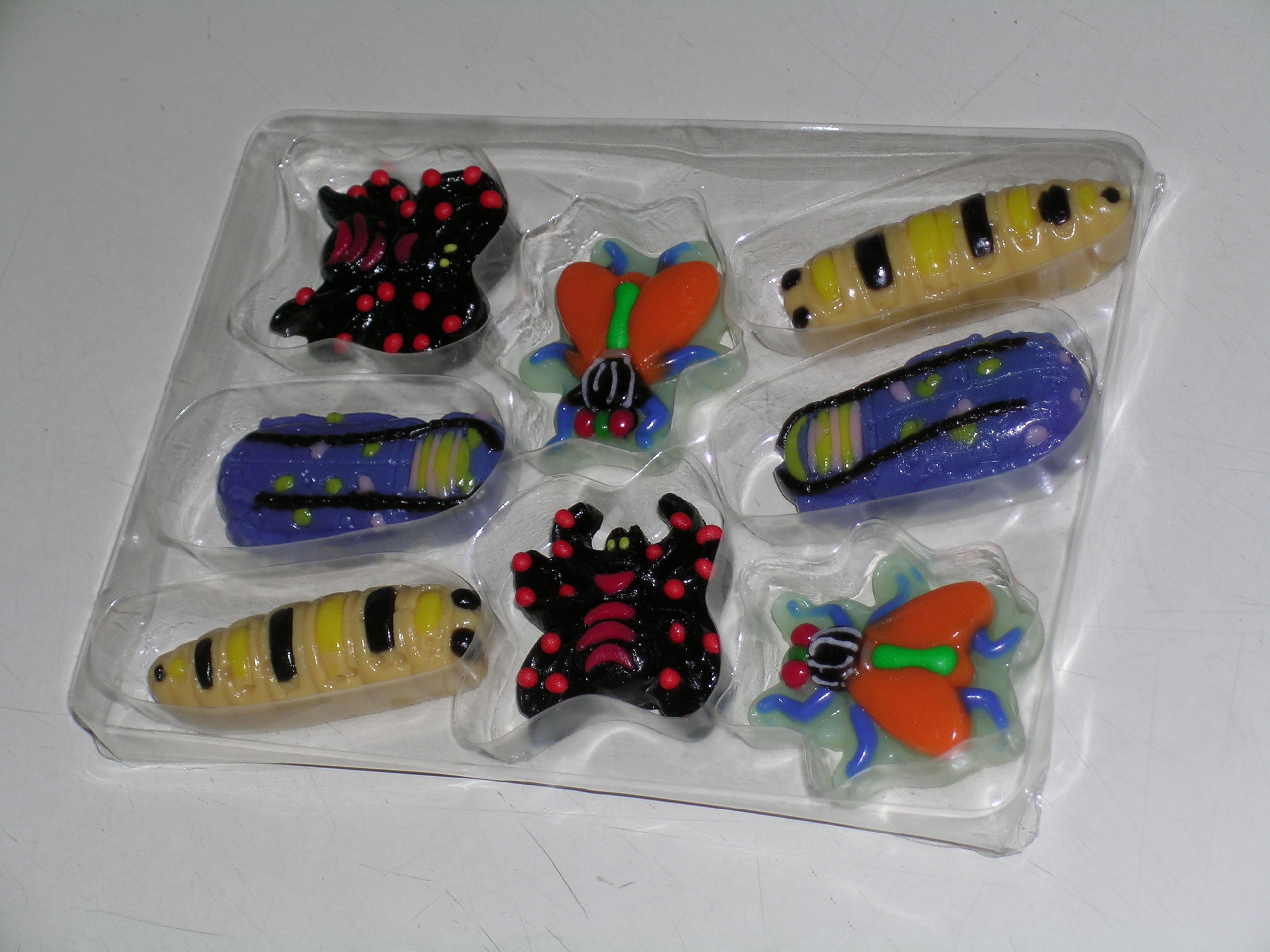 Freaky Fingers…  I’ve come across two large sized gummi severed hands this season which in and of itself is cause for celebration. For this Flix candy severed hand installment I was really jazzed by the coloring and the detail in the molded design. This looks like a perfect gummi zombie or decompsed corpse hand, though unfortunately as far as taste and consistency goes, this was horrible. The candy tastes like it's laced with a low quality gasoline or petroleum product of some sort, and it was tough as all get out. Maybe this is the trade-off for such a nice appearance and design, but if that's the case give me less detail and colors and a better taste and mouth-feel. This is candy we're talking about and it shouldn't be a chore to eat it.  If nothing else, I hope Flix candy keeps plugging away at their formulas and hopefully they can find a nice middle ground between appearance and taste. They are trying which is something I can't say about a lot of other companies out there… Category:Halloween 2008
-- posted at: 3:22 PM Comments[1]
|
Tue, 14 October 2008
If I had to pick my favorite scary, creepy, Halloween-y character ever, it would most likely be Frankenstein's monster. There's something about his sad, lumbering, misunderstood figure that I can identify with. Over the years I've amassed a small collection of Shelley's book, as I'm always willing to pick up a new copy when I find a cover I really like, or (gasp!) if it's illustrated. One of my favorite permutations of the book is the 1988 Step-Up Classic Chillers adaptation by Larry Weinberg (published by Random House.) It's not the adaptation that I love, but the creepy cover (painted by Lisa Falkenstern), and the interior pen and ink illustrations by Ken Barr…  There's something very menacing about the way the monster is pulling back the shroud on the cover; there's a bit more of the spark of life in the character's face and intent in his posture. As far as the interior illustrations go, I was surprised by how influenced they were by the classic Universal version of the creature's visage (I always thought that Universal was pretty litigious when it comes to squared-off, flat-topped interpretations of the monster.) Ken Barr's illustrations are really fun and are in the vein of 70s and 80s era comic book art (which makes sense considering Barr did a lot of work for Marvel and D.C., as well as men's adventure magazines.) If I'd have found this particular version as a kid I would have flipped for it…  In particular I love how aged and weather beaten the monster's face appears, with the hard worn wrinkles and deep crags around his eyes and the evil looking laugh lines around his mouth. Granted, I also love the more standard vacant or innocent look the creature is given, but every once in awhile it's refreshing to see the seething anger just below the surface of the monster, if not outright as it is in this book…       Category:Halloween 2008
-- posted at: 4:37 PM Comments[1]
|
Mon, 13 October 2008
As a quick aside from the Halloween festivities here at Branded, I thought I'd take a second and point to a fun project that Diana Nock put together on her newly re-designed site…
 If you were ever curious about seeing over 150 different artist's interpretations of swashbuckling, romantic, fuzzy, blue, teleporting elf Nightcrawler (of X-Men, Excalibur, and six million other Marvel comics fame), then take a second and check out the Nightcrawler Sketchbooks. It's a hoot. Category:general
-- posted at: 7:17 PM Comments[1]
|
Mon, 13 October 2008
Well, I did some podcasting this weekend, though it wasn't what I thought I might be doing. I won't go into the specifics until they're final, but I'll be a guest on another show in the coming weeks, and I snagged some audio for a Branded podcast that I'll hopefully have up this coming weekend. Should be fun. For the countdown today I present a few comics by the mega-awesome Sergio Aragones which he did for the October 1987 issue of MAD magazine. They all center around A Nightmare on Elm Street 3: The Dream Warriors… 
Category:Halloween 2008
-- posted at: 3:53 PM Comments[1]
|
Fri, 10 October 2008
Well, today wraps up a week-long look at my collection of animation cels from the Real Ghostbusters cartoon, an even though I'm not familiar with the episode this particular set of three cels comes from, it's my favorite example from the show…  When I first started picking up animation cels my wife was a bit skeptical. Even though she still adores cartoons in general, she wasn't sold on the idea of animation cels as interesting or as a piece of art. We came to the conclusion that she was really missing the overall appearance of the cartoon in that there were no backgrounds to go along with the still images I was showing her. I guess character cels out of context just didn't seem as much a part of the show, even though these are the exact cels that were filmed. There's just something to be said for the aesthetics of a complete image, even if it's not exactly feasible to obtain painted cartoon backgrounds. For one some backgrounds are very large paintings that encompassed entire environments and were "zoomed in on" or cropped as the 8"x10" or 11"x14" cel layers were placed on a section. Others were used repeatedly in many episodes and are much rarer (especially in terms of being packaged up with the photographed cels and stored after a series was done.) So when I happened upon the set pictured above, I knew my wife's eyes would light up as it's a much better example of a cartoon micro-second frozen in time. Now technically this set doesn't have a traditional background included. The cloud of purple smoke rippling behind the three anthropomorphized animal creatures is also a single cel that included its own moving aspects. It's enough to fool the eye though and that's all that matters (at least to my wife.)  Besides the completeness which appeals to me, I also think it's a perfect example of the great animation that existed on the show. The rest of the cels I shared earlier in the week all seemed a bit rougher in terms of graceful line work, and since they were taken out of context of the scenes they were originally in you don’t get a feel for the over all compositions and color schemes from the cartoon, which I am still a big fan of.  These figures are alao a heck of a lot more dynamic in terms of shape and depth because there is a layer of shadow and highlights to the figures that I'm not finding in a lot of the other cels I've purchased. This is an aspect of animation that really resonates with me, and it's why I was so drawn to anime when I first discovered it in the early 90s. When you compare a lot of traditionally animated fare from America (whether or not it was physically animated overseas) and most anime you'll notice this is one of the big differences, the use of layers of shadows and color variation that really makes animation pop. When I first started coloring my own art digitally, adding these additional layers was the "eureka" moment I needed to understand the process better (I wrote about this awhile back here.) I wonder if this is a step that tends to get skipped because of the possible expense in terms of time and energy spent on an aspect that will most likely be ignored by the target audience?   Also, I wanted to take a second to remind everyone that the complete Real Ghostbusters series is going to be available for purchase soon. You can pre-order your set at the Time Life website (which is the only place outside of used copies that might end up on eBay) for $179. Though I'm currently coveting the set, I don't think it's going to be one that I can work into my DVD budget at that price (an in the complete series format.) So this closes the chapter on Halloween-y animation cels for this year's countdown. For the next couple weeks I'm going to keep the posts a little more random, though mostly 80s influenced. Also, I might be back this weekend for some more movie commentary podcasting, but first I need to watch more flicks… Category:Halloween 2008
-- posted at: 1:52 PM Comments[2]
|
Thu, 9 October 2008
A bunch of Real Ghostbusters animation cel posts wouldn't be complete without one red-haired, sassy, bespectacled receptionist extraordinaire named Janine Melnitz!  In film and in TV Janine Melnitz gets credit for being one of my first real crushes (in good company with Faye Grant from V, Mitzi Mozzarella from the Showbiz Pizza Rock-Afire Explosion Band, Jacqueline Bisset circa 1983 in the flick Class, and of course Adrienne Barbeau.) One aspect of the character that I always found interesting was that she was pretty different style-wise in the cartoon than in the first movie, but by the time the second movie rolled around, the writers and designers (or at least Annie Potts) decided to co-opt the look from the cartoon. I did think it was kind of a cop-out that she dropped her interest in Egon in the 2nd film for of all people Louis Tulley.  Anyway, back to the cel, as you can see above this cel is a prime example of the damage that can be done over time by storing them directly on top of the pencil under drawings. The under drawing adhered to the paint and was destroyed, forever merged with the cel. Granted, I don't think studios ever thought of the post-photographed cels as any sort of asset and I'm sure stuff them into boxes and packed 'em in un-climate controlled storage facilities to gather dust until the day when some unsuspecting citizen bought them in a blind storage auction. Being a huge fan of 80s cartoons, and considering these cels as pieces of art in and of themselves, I think it's a downright shame that they're mistreated and I'm sure a good portion of them are lost to time because they've either deteriorated or become one huge merged stack of cel, paint and paper. Oh well, at least I’ve managed to find a few and give them a good home. More or less rounding out the main cast of the Real Ghostbusters cartoon is one of my least favorite characters, Slimer, the ugly green spud himself.  Though I didn't mind him as a humorous villain in the live action flicks, his presence in the cartoon added an unwelcome air of Scooby Doo-ness. Now don't get me wrong, I love Scooby Doo, but I never thought the Ghostbusters needed a pet-like mascot, and besides the odd relationship between Lydia and Beetlejuice in the BJ cartoon, I wasn't very find of twisting around the hero/villain roles for cartoon adaptations of movies. It doesn't help that as the series went on it morphed into an almost all-Slimer show which was nowhere near the quality of the proceeding seasons.   Category:Halloween 2008
-- posted at: 8:16 AM Comments[4]
|
Wed, 8 October 2008
Honestly, I'm not quite feeling the Halloween-y with these Real Ghostbusters cels, so to remedy that a bit, lets skips past more cast members and get to some of the nifty monsters from the show! These rat-like subway creatures are some pretty gnarly customers. I think they're a nice example of the non-ghost cryptozological wonders that our four heroes battled against on a regular basis in the cartoon…  As for interesting aspects to this first cel, I really dig the pencil under drawing that I scored with it. I'm not sure if the under drawing is hinting at the next drawing (which I suspect), or referencing the previous drawing and cel, but I love the alternate view of the creatures with their sharp-toothed mouths all agape. The creatures sure seem a heck of a lot more fierce that way to boot.  Here's another cel of the same creatures from a later scene…   There, that's a bit more in the mood I'd say… Category:Halloween 2008
-- posted at: 8:45 AM Comments[1]
|
Tue, 7 October 2008
Today's cel completes the core line-up of the Ghostbuster crew with Winston Zeddmore (Zeddemore in the movies) and Ray Stanz. As opposed to yesterday's cels, both characters are painted on the same layer which I think is kind of weird. Like I mentioned, I'm kind of confused as to when animators will combine characters on the same cel or split them up. I sort of figure that characters would be separated when one or both are "moving" so as to make it easier to keep them independent or save on mistakes, but in this cel it appears that Winston and Ray are having a conversation which would imply movement, at least in their heads and mouths. I don't know…  Also in the vein of yesterday's discussion, I wanted to note that Winston also underwent a change between the movies and the cartoon in that the character seems much younger and enthusiastic, while dropping the almost burnt out mellowness of Ernie Hudson's live-action portrayal. I think character-wise he ended up changing the most, probably to make him more appealing to kids.  One of the other aspects that this cel illustrates is how much cheaper the actual paint stock seems in comparison to cels from other cartoons. It's thin enough so that you can clearly see the photocopied line work on the cel through the layers of paint.  Lastly, even though I always felt that the Real Ghostbusters had much better animation that a lot of its contemporaries, I'm not so sure now. Looking at the pencil line work above for instance there seems to be a less sure hand at work. It's either that or it was drawn super fast as a lot of the lines don't connect or feel kind of wavy, not nearly as fluid as some of the other pencil under drawing work that I've seen. Again, because of super hectic animation schedules or less experienced animators, I'll probably never know… Category:Halloween 2008
-- posted at: 4:00 PM Comments[1]
|
Mon, 6 October 2008
Well, I didn't get off my lazy butt for a Sunday post, but the world isn't ending because of it (there are so many blogs doing Halloween countdowns this year I think we can all stand to take a break for a day here and there.) This week I thought it would be fun to have my normal subject matter and the Halloween countdown converge with an entire week of animation cels from the Real Ghostbusters cartoon. I recently picked up a bunch of nice cels and have been talking about them in my regular Cartoon Commentary! column. So break out the proton pack, warm 'er up and get ready to bust some ghosts (or do something more creative like redecorating your house with the portable nuclear generator strapped to your back, or rescue some helpless kittens in trees by blasting them off the branches, it's up to you.)  I picked up these first couple cels as a set. In this scene Peter Venkman and Egon Spengler are walking together. Now one of the things I love about going over these animation cels is trying to learn more about the process of making cartoons by studying the art and how it was put together. These cels raise the question of scene construction for me. Now I always assumed that a scene with multiple characters would be broken down into many layers of cels, each with one aspect of the scene painted on it. For this set of cels there's one for Egon, one for Peter, and I assume there was at least a background (and possibly another layer of background objects that might be moving.) On the other hand, I figured that if two of these aspects come into contact (outside of the background which is typically not on a cel, but rather a painting that the cels are shot on top of, or which are transposed onto later in the process) that they'd end up being painted onto the same cel. I've seen examples of this in cels available on eBay where characters grabbing each other, or layered on top of each other are on the same cel (in fact the cel that I'm going to share tomorrow has Ray and Winston together on the same layer.) Well since this set is in two layers, it makes me wonder why. My best guess is that one or both of the characters won't stay static for very long, so it would be easier to just paint that character again on a new cel to show the movement, and there would be less of a chance of screwing up and less work in general than having to paint both characters over again.   Another aspect to this set that I found interesting are the pencils for Peter that I picked up along with the cels. The whole form that appears on the final painted cel isn't in the pencils. Again, this suggest to me that the animators used the body that was already drawn for the previous cel and just changed his head. This seems like a pretty standard way of saving on drawing time. What I'm curious about is how they merged the two sets of pencils (this head with the previous body) for photocopying onto the cel above. Since this drawing of Peter's head is still on a full sheet of paper and not cut out and pasted over the previous body drawing's head, how did they get the new final image? In the examples of this time saving practice that I've seen before, the new pencils are typically added to a photo copy of the previous drawing, which when copied onto the cel looks like one smooth set of line work. I guess the animators in Korea could have photocopied this drawing of Peter's head and pasted it over the other drawing. Again, it then raises the question of how they store their finished work when it's done and what sets of pencils to keep with what finished cels. Actually that's more of a nitpicky question that seems a bit too pointless to wonder about (unless I'm planning on getting a job collating for an Asian animation house.)  These cels are a nice example of how not to over work one's self as an animator. Notice that Egon's right shoulder is missing the Ghostbuster's logo patch. Obviously there's no point in drawing it, and then wasting paint when the shoulder is just going to be covered up by Peter in the shot. Of course I wonder where it's best to draw the line on this sort of practice. I mean why not leave off most of Egon's right arm while you're at it? Seems sensible enough, though maybe the logistics of not finishing the drawing might make it a little more difficult or tricky to animate (like if the cels where laid down in the wrong order, there would be one weird looking armless Egon instead of him just missing his BG patch.)   I do have to wonder why the producers and designers of this cartoon decided to make the characters so different, not only from the original movie, but between the various character designs. I suppose this was an extreme and early example of the Teenage Mutant Ninja Turtles phenomenon where it would be easier for kids to tell the characters apart if they had their own color schemes, in particular with the hair colors. I always thought it was a very odd decision to make Egon tow-headed instead of having dark hair. Not only does it seem really out of place when comparing him to his real life counter part played by Harold Ramis, but it changes the characters possible Jewish ancestry to something more Nordic (or Jewish new wave/punk.) What's even weirder to me is that I never questioned it as a kid. Egon was Egon, and that was all there was to it.  Category:Halloween 2008
-- posted at: 5:26 PM Comments[1]
|
Sun, 5 October 2008
Well, I decided to record a podcast about some of my movie watching this Halloween season, and hopefully I'll get it in just under the wire for day 4 of the countdown. It's about 25 minutes long, so it won’t melt your brains or anything, and for those of you brave enough to make it through the whole show there is a little treat at the end. I basically talk about two movies, The Abominable Snowman (the 1957 Hammer Yeti flick starring Peter Cushing and Forrest Tucker) and the 1972 Amicus adaptation of Tales From the Crypt (also starring Peter Cushing and a young Joan Collins.) Below are some screen captures of interest and the original movie posters. Enjoy!   Above are stills of the amazing Peter Cushing, and Forrest Tucker (star of F-Troop and the 1975 Filmation Ghostbusters live action Saturday Morning show that I talked about some time back.) Below is an example of the surprising cinematography in the flick…  I love how the Yeti were handled visually in the film. Subtle, but effective.  Below, the awesomely creepy poster for the Amicus adaptation of Tales From the Crypt…  Here we have some still from TFtC including our unsuspecting tour patrons, and the understated Ralph Richardson as the Crypt Keeper…  Below we have some hints as to the dreadful fun that this flick contains…  Hopefully I'll be back tomorrow with a look at a couple of the 80s horror flicks that I loved growing up. Comments[3]
|
Fri, 3 October 2008
Category:Peel Here Volume 7
-- posted at: 3:00 PM Comments[9]
|
Thu, 2 October 2008
So, ever since last year I've been keeping my eyes peeled for anything that seems to fall within the realm of Halloween-y goodness, particularly from the 80s. Last year one of the only things I managed to find from my favorite decade was a monster themed Muppets comic from a weird magazine-like children's book called Muppet Madness. I was curious at the time if the material in the book was culled from the run of Muppet Magazine, and I've since learned that it wasn’t as the magazine was published later on in the 80s. I lucked out and my good friend Kevin has had a copy of said magazine tucked away for the last 23 years, which he let me borrow for some site content…  Well, even though there's nothing that really screams Halloween (in Jim Henson's Kermit voice as he shakes his head about in exasperation no less), but there is something that kind of qualifies. Since I'm going to talk a bit about the Real Ghostbusters cartoon this month (all next week so be prepared), I wanted to share this Muppets movie spoof comic called groaningly and punnily enough Grossbusters, written by one Jay Itzkowitz and illustrated lovingly by Jon McIntosh.      Honestly, I'm sort of surprised that Itzkowitz didn't make use of the Muppets own weird science wonders Bunsen and Beaker, who I think would have made an awesome addition to the spoof Grossbusters cast (especially instead of Rizzo and his pals on page 4 panel 3.) I did however think that Janice was a great stand-in as the Janine character. I also really dig that their Grossmobile was modeled off of the Muppets bus more than say the original Ghostbusters Ecto-1. Lastly, how about Gonzo really pushing that peanut butter & macaroni sandwich with a side of coleslaw joke? Man, he must have been storing that one up. Category:Halloween 2008
-- posted at: 1:37 PM Comments[3]
|
Wed, 1 October 2008
So, for this first day of October, and for the first official post of the Halloween countdown this year I thought I'd go over some of my pre-season shopping experiences at the usual suspects like Target, Wal-Mart, the Spirit Store, Spencer's, and Toys R Us. To tell the truth, I was looking forward to the seasonal macabre sections in these consumer megaplexes even more than usual this year, if nothing else to get my mind off of work. It didn't help that I was super excited to see what the various stores came up with this year as most of the stores had some great stuff last year (from mascots to candy and décor.) Unfortunately, it's beginning to seem like a bust (at least for my tastes) as most places don't really seem to be in the spirit and the one who are, seem to be a little bit lazy or schizophrenic about it. I think I just wanted the shopping experience to be way to splendiferously awesome that I've harshed my own mellow with expectation. The other aspect to perusing the Halloween-y store shelves this year that was sort of a downer was a weird crack down on inside-store photography. Granted, it's usually best to seek permission before walking into a place and snapping a bunch of pictures, but I'm more of the sneaky sneak when it comes to this sort of tradition. Well, all of the Halloween specialty stores in the area have started posting "No Photography" signs everywhere. As silly as this sounds, I can't help but think I contributed to this as I was "caught" in a couple places last year and almost but not quite grilled about my spooky store shutterbug hobby. Granted, I'm sure my antics don't hit on the radar of the big wigs at these places, but at the same time I know that a lot of these places are owned by the same companies (The Spirit stores are a Halloween liquidation front for Spencer's), so many a memo went around. Heck maybe a lot of bloggers have been caught snapping pictures of these fine institutions and it's becoming a concern. Who knows. At the end of the day it was sort of a bummer, though to be honest, there wasn't a whole lot to photograph. Basically the only two places that seemed to merit a little bit of photo archiving are Target and Toys R Us, and the latter isn't all that interesting as far as the in-store stuff. So practically all my photos this year are from Target, though I did go ahead and snap a picture of a new seasonal store called Halloween USA…  Inside it was basically an exact replica of the Spirit store, though a little more spacious as it was housed in an old department store location. This place did have an advantage over the Spirit store in that they had a larger selection of props, general Halloween goofery, and décor, though this is a segment of holiday shopping that seems to be shrinking across the board. The Spirit store has almost entirely scaled back to pre-packaged costume sets, though they still have a decent (though somewhat stagnating) selection of costume props. I'm missing the lack of plastic/wood/ceramic skulls, fake torn-off limbs, little monster shaped baubles and the like though. Maybe stores like this require you take a break for a couple of years so as to not burn yourself out. I'm sticking to that thought… By far, and as in most years, my favorite showing was at the local area Targets. This year (like the previous) Target has decided to base their basic seasonal design around an already established property, Domo, which according to wiki is the mascot of the Japanese NHK television station. The character is apparently a "strange creature who hatched from an egg" (according to the official site), lives in a cave, passes gas when he's nervous or upset and doesn't like apples. Besides the fact that he looks like an adorable monster, I have no idea why Target decided to co-opt Domo for their Halloween advertising as there's noting spooky or really Halloween related about the lug. There are a ghost and a couple of bat characters in the Domo universe (you can visit all the characters here), but none of them are used in any of the Target marketing as far as I can see. Color me old and out of touch, but I just don't get it. He is cute though…     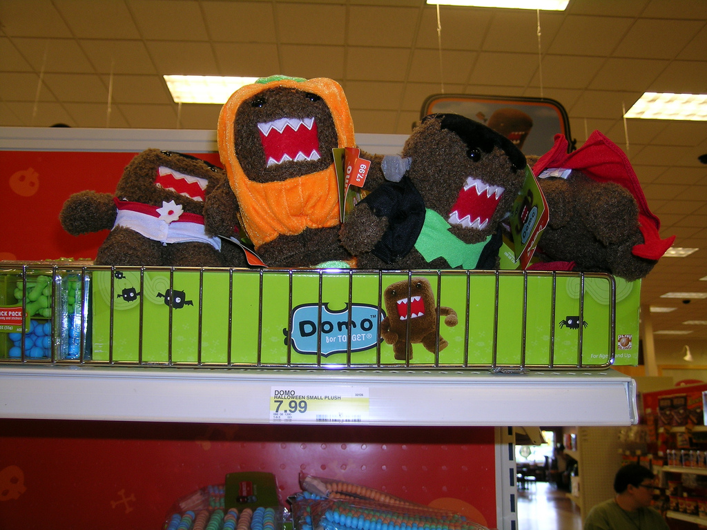   What's kind of weird about the Domo Halloween branding is that besides all of the signage and there is only a small endcap of Domo Halloween products. Everything else is covered in what I assume is Target specific Halloween branding, an evolution of their cute monster characters from years past. This is sort of what I was referring to as schizophrenic branding. Why go to all the trouble of securing the rights to Domo when the majority of your store branded merchandise features a completely different design campaign? They've also seemed to scale back on the Mexican Day of the Dead theme to a lot of past years products (like my beloved mariachi skeleton), focusing instead on the black laser cut metal baubles and faux statuary…   They do have one heck of an awesome Day of the Dead skull Bucket, though it's so large that I have no earthly idea what I'd do with it.  As far as their own character branding, it's pretty prevalent though out the department, and it even shows up on a bunch of name brand products like Bounty paper towels, Zip Loc sandwich bags, and Softsoap hand soaps. Again, it's kind of weird and unfocused. I assume if you aren't as anal about useless pop culture non-sense, you know, a normie, you wouldn't even realize there were a set of Target branded characters floating around out there…   Most of the candy from previous years has shown back up on the shelves in new packaging like the large gummy tongue/vampire fang sets, the finger lollipops, and test tubes full of powdered or Halloween themed Runts-like candy…   I was surprised to see a new section crammed in next to the candy though. Apparently Target is taking another shot at pushing the idea of a more personal family oriented Halloween celebration in the form of themed party games (in the past couple years they've been featuring more and more candy products that stray from the traditional fun-size neighborhood trick-or-treating fare, going for a more celebrate by yourself giant gummy frog type of deal.)   As is now tradition, there was a whole new crop of Jones Soda products in a bevy of odd flavors to wet one's gullet. They've nixed the Gruesome Grape and Spiced Cider from the mini can line-up and added Spookiwi, and Buried Pomegranate. They've also dropped the jack-o-lantern theme to the can design and ushered in a awesome line of classic monster mugs. I’m especially fond of the werewolf design, though I can't stand their candy Corn flavored soda…     As I mentioned above I was also very impressed with Toys R Us this year, though not for any great products or branding in the store. I'm surprised that they took their design aesthetic from last year with the super deformed, almost vinyl toy-looking, mascots and put it to a broader use. There was a ton of cheap toys and games with the fun looking trick-or-treat monster mascots. Here are scans of the main characters (there's also a cat and a Princess that aren't quite as cool):           I was hoping to find the same sort of brand building at Wal-Mart this year after I fell in love with their Frankenstein's monster branding from last year, but instead they went in the total opposite direction packaging all over their stuff in horribly boring plain orange packaging. You couldn't make it look more generic and cheap. I didn't even bother dragging the camera into the joint as it was just too boring. Oh well. Hopefully I've gotten the ranting side of things out of the way for the rest of the month and now I can concentrate on looking back a couple decades into the Halloween-y stuff of the 80s. Tomorrow's post will echo a puppety one from last year that I enjoyed. See you in 24 hours or so… Category:Halloween 2008
-- posted at: 9:48 PM Comments[8]
|
Wed, 1 October 2008
Oh my god, time is flying. I took an unofficial break from blogging this past month in the hopes of recharging my batteries (and giving a little more time for the day job which has been hectic) and getting ready for the Halloween season. Well it’s here way sooner than my internal clock expected. Anyway, here’s my up to the minute announcement of my month-long Halloween-y blog-a-thon dealy, or what ever you want to call it. I plan on keeping a weekday posting schedule, taking the weekends off to catch up or to possibly do some movie commentary podcasts (80s creepy flicks that I love, and no, not full commentaries, but just my thoughts on the flicks.) Also, as I mention in the podcast attached to this post, I’m going to try and concentrate on some 80s-esque Halloween fun for this year’s countdown. I’ve got some themed weeks planned coming up as well as some miscellaneous odds and ends. Hopefully it’ll be a blast. I’m going to try my darnedest to be back this evening for a more official post in this years countdown, so break out last years candy corn, dust off your formal-wear cape, dredge up that cackling witch laugh, and get ready for some spooky Branded fun! By the by, there are about 6 million others participating in this year’s Halloween blog craziness, and these are just a few (swiped with permission from the great John Rozum, feel free to pass it along!): All Eyes and Ears Azathoth's Abode on the Plateau of Leng Azathoth's Abode on the Plateau of Leng:The Dungeon Branded in the 80s Bubba Shelby Cavalcade of Awesome Cool-Mo-Dee Creepy Los Angeles Dave Lowe Design! Distinctly Jamaican Sounds Diversions of the Groovy Kind Dr. K's 100-Page Super Spectacular Dr. Squids Smorgasbord of Terror Drunken Severed Head Frankensteinia Franklin Mint Halloween Addict Harvey's Midnight Hour The Holiday Queen The Horrors of it All Houses of Wax I-Mockery John Rozum Monster Crazy Monster Memories Monster Rally Monsters and More Mostly Ghostly Music From the Monster Movies 1950-69 Music You (Possibly) Won't Hear Anywhere Else Neato Coolville Negative Pleasure Nostalgia Factory A Nostalgic Halloween Oh the Horror Orange and Black Para Abnormal Plaid Stallions Plastic Pumpkins Pumpkin Hollow Pumpkinrot Random Acts of Geekery The Retropolitan (?!?) The Sexy Armpit Sweet Skulls 13 Visions Tikiranch Trixie's Treats Universal Horror Sounds Valhella Vinnie Ratolle's Records Weird Hollow Wonderful Wonderblog X Entertainment Comments[7]
|
Branded in the 80s!
The Podcasts


Links:


Archives:
| S | M | T | W | T | F | S |
|---|---|---|---|---|---|---|
| 1 | 2 | 3 | 4 | |||
| 5 | 6 | 7 | 8 | 9 | 10 | 11 |
| 12 | 13 | 14 | 15 | 16 | 17 | 18 |
| 19 | 20 | 21 | 22 | 23 | 24 | 25 |
| 26 | 27 | 28 | 29 | 30 | 31 | |
March
February
January
December
November
October
September
August
July
June
May
April
March
February
January
December
November
October
September
August
July
June
April
March
December
November
October
August
July
June
May
April
March
February
January
December
November
October
September
August
July
June
May
April
March
February
January
December
November
October
September
August
July
June
May
April
March
January


