Editor's note: The following post was written by PowerPoint MVP Glenna Shaw as part of our Technical Tuesday series.
When PowerPoint Designer’s new timeline feature was released I loved it. But I also thought, “What if you’re using a custom theme or running an earlier version of PowerPoint?”
In this, I was inspired to see what you could do to create your own timelines using PowerPoint’s and Excel’s charting tools. This article includes instructions for working with date and time values in Excel, as well as how to create the custom timeline charts I came up with.
Working with Dates and Time
Some folks may find it tricky to work with dates and time in Excel, but it’s pretty easy if you stick with using all dates or all times on your charts. Excel usually applies the correct formatting for you if you enter the data in the right format. For dates, type in MM/DD/YYYY. And for time, type in HH:MM AM/PM. You shouldn’t have to worry about formatting. If you do need to correct formatting, use the formatting drop down on the tool bar and choose the date or time format as appropriate.

The Timeline Chart
This chart is pretty easy to make, and you can fancy it up as much as you want with just a few formatting changes. It uses a line chart with each of the items, having a value of 1 so you get a nice straight line. One of the advantages of the timeline chart over the Designer timeline is the proportional spacing of the dates/time. The Designer timeline will space the steps equidistantly as opposed to relevant to the dates/times. Here's how to do it:
1. Insert a line chart with markers on your slide.
 2. In the Excel window, change the data to what you want for your timeline.
 3. Replace Categories with your timeline steps, enter the dates (or time) in the second column and in the third column give each step a value of
4. Close the Excel window.
Your chart should look something like this:

5. From the Chart Tools Design tab, click Select Data.
6. Select the B and C columns for your data and click ok.

Your chart should now look something like this:

Now you just need to add data labels and format it a bit. Set them as follows:
- Values from Cells: Column A
- Category Name
- New Line Separator
- Label Position Above Marker

7. Adjust the Vertical axis to a minimum of .5 and maximum of 1.5 and set the Major Unit to 1.

8. Using the Chart Elements Icon, uncheck everything except Data Labels.

9. Format the markers to be a larger size. If desired, change the marker to a different shape.

10. Make any other formatting changes you’d like. Here's the result:

The Simple Gantt Chart
Gantt charts are useful when you want to track multiple tasks that have varying timelines. Typically, these tasks will have a start date and end date. The first Gantt chart I learned to do was from a tutorial by Jon Peltier using a stacked bar chart. This approach is much simpler. You can find more detailed directions for these charts in Jon Schwabish’s A Guide to Advanced Data Visualization in Excel 2016/Office365.
Gantt Table
This visualization is very easy to do and just requires you to prepare your data (meaning start dates and end dates) before drawing your table. This chart is very effective but it does have the same limitation as the Designer timeline - each of the dates appear equidistant from the others. This makes it a perfect visualization when your dates are of equal measures, such as weeks or months, and you don’t need to be more specific.
- Create a table on your slide with enough columns for your dates + 1 and enough rows for your tasks + 1.
- Enter your start and end dates sequentially in the top row starting with the second column.
- Enter your tasks in the first column starting with the second row.
- Shade the cells for the start and end date for each task on the appropriate row.
- Format the table as desired. Here's the result:

Gantt Line Chart
This chart capitalizes on the layout of the Gantt table but addresses the issue of equidistant spacing between dates. It uses a line chart with incremental values for each task to place them one above the other. This chart is more effective when you need detailed dates and they are not of equal measures.
1. Insert a line chart with markers on your slide.

2. Enter your dates and tasks as described for the Gantt table.
3. Add numbers in the cells below the start date and end date for each task. Increment the number for each row by 1.
4. Stretch the chart table selection box to cover all your data.

5. Close the Excel window. Your chart should look something like this:

6. From the Chart Tools Design tab, click Edit Data.
7. Click the Switch Row/Column button and click ok.

8. Close the Excel window.
9. Format the vertical axis to show the values in reverse.
10. Using the Chart Elements icon, uncheck everything except the primary horizontal axis and data labels.

11. Set the data labels to Series name and Label Position Left
12. Click twice on the second data label of each task and delete the data label.
12. Format as desired. Here's the result:

The Clock Chart
This next chart is bit unusual. It uses a pie chart to display the timeline as visual chunks of a day or an hour. It’s a great visualization if you are giving a presentation that has an agenda broken into chunks of time over a day or an hour, such as training or a meeting. The slices on the day chart will align with the location of the hour hand of a clock and the slices of the hour chart will align with the minute hand. These charts allow the audience to easily see how the day/hour is divided up.
Daily Agenda
The daily agenda chart starts at 6 AM and ends at 6 PM to use the full 360° of the pie chart. The first row of data accounts for the time from 6 AM until your agenda starts and the last row accounts for the time your agenda ends until 6 PM. The chart is rotated by 180° to orient the slices properly.
1. Insert a flat pie chart on your slide.
 2. In the Excel window, click the Edit Data in Microsoft Excel icon.
 3. Enter your Agenda Topics, Start times, and End times as shown:

- The first row should start with 6:00 AM and end when your first agenda item starts.
- The last row should start with the time your last agenda items ends and end at 6:00 PM.
- Make sure your start time and end times are formatted as time.
- For the Duration column, you need to enter this formula: =[@[End Time]]-[@[Start Time]]
- Once you enter the formula, it will automatically copy to the entire column.
- If you want, you can format the duration column as h:mm, but you don’t have to.

4. Close the Excel window.
5. From the Chart Tools Design tab, click Select Data.
6. Uncheck the Start time and End Time Series and change the Horizontal axis labels to the Start Time column.

7. Your chart should look something like this.

Now you just need to rotate the chart, add data labels and format it a bit.
8. Click on the pie chart and right click, Format Data Series.
9. Change the angle of first slice to 180°

10. Add data labels and set them as follows:
- Values from Cells: Column A
- Category Name
- (space) Separator
- Label Position Outside End
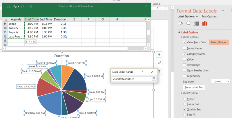 11. Using the Chart Elements Icon, uncheck everything except Data Labels.

12. Delete the data labels for First Row and Last Row and recolor those slices to be the same color.
13. Use shapes to create clock hands on top of the chart.
14. Apply other formatting as desired. Here's the result:

Here's the Alternate Daily Agenda Chart:

Hourly Agenda
The hourly agenda chart starts at the top of the hour and ends at the close of the hour. It automatically uses the full 360° of the pie chart as long as you account for the full 60 minutes of the hour. The hour chart does not require rotation.
- Repeat steps 1 – 2 for the Daily Agenda Chart.
- Enter your Agenda Topics, Start times, and End times as shown:
- Make sure your start time and end times are formatted as time.
- For the Duration column, you need to enter this formula: =[@[End Time]]-[@[Start Time]]
- Once you enter the formula, it will automatically copy to the entire column.
- If you want, you can format the duration column as h:mm, but you don’t have to.

3. Repeat steps 4 – 7 for the Daily Agenda Chart.
4. Repeat steps 9 – 11 for the Daily Agenda Chart.
5. Repeat steps 12 – 14 for the Daily Agenda Chart. Here's what it looks like:

This article has provided you with three new options for visualizing time in your presentations:
- Timeline chart
- Simple Gantt chart
- Clock chart
I hope you find them helpful and fun to use.
You can download the TimlineClocksCharts.pptx file from my OneDrive Visualology folder. All my other samples, templates, and resources are also available for download.
Note: you must download the file to view it properly in PowerPoint 2016.

For more than two decades Glenna Shaw has been creating data visualizations in the form of presentations, project management tools, dashboards, demos, prototypes and system user interfaces. She is a Certified Project Management Professional (PMP) and an active member of the PowerPoint Community. Glenna specializes in creating Microsoft Office files that are fully accessible to persons using assistive technology.
Glenna has been a spotlight speaker at events, a subject matter expert (SME) and author/technical editor for books and training courses. She frequently teaches advanced PowerPoint, Excel, and Word classes. Glenna is also the author of tutorials on using sensory psychology with presentations on her glennashaw.com site.
Glenna has served on the board of directors for the Presentation Guild™ since 2015. She is the chairman for the committee that is setting standards and implementing certifications for the presentation industry.
Glenna holds certificates in Cloud Computing, Accessible Information Technology, Graphic Design, Information Design, Knowledge Management and Professional Technical Writing.