Stop Using Arial & Helvetica
Arial and Helvetica are the default font stack for most browsers and for most of the websites. That's bad, really really bad. Arial and Helvetica suck on web and for paragraphs of text - they are unreadable (as compared to many other typefaces created specifically for web). And Helvetica looks ugly without proper kerning and Arial is just an ugly bastard son of Helvetica.
Some people actually have a reason to use them but most use it mindlessly - just because everyone else does. Often, no thought is given to design of the site, let alone typography.
Let me expand on merits and demerits of these defaults:
Helvetica
Films have been made and songs are sung in name of Helvetica. And all that is well-deserved! Helvetica is one of the best typefaces ever created and is still as relevant as it was when it was created.
But it is a very bad choice for web - especially when you have a paragraphs / chunks of text to typeset. It might work with headlines. Helvetica almost always requires custom kerning to bring out the best. That's something that you cannot do for every word you ever wrote on web.
 Here is a comparison between Helvetica and Lucida Grande (My favorite typeface). Just keep reading and you will see the difference.
Helvetica is great. It's brilliant for print world, brand identities and maybe even headlines. I love it for that purpose. In fact, most of the brand identities I've created are typeset in Helvetica. But please do us a favour, don't use it on the web.
Helvetica Neue was recreated for web. It is much better than bare Helvetica; but again it is not as great as many other typefaces crafted for web. And availability is a big problem on Windows.
Arial
Arial is notorious amoung designers as Microsoft's bastard son (rip-off) of Helvetica. It's just a bad copy of Helvetica - a really bad one. It's just ugly.
 That's Lucida Grande vs. Helvetica vs. Arial.
But there are sites and designers who have managed to make even Arial work for them. But same amount of effort will yield much better results in other typefaces.
Some popular sites that use Arial and Helvetica nicely:
GitHub uses Helvetica; but on most Windows machines it defaults to Arial and they pull it off very nicely:

Except some parts which can be much better with a different typeface:

Gmail also does a great job of typesetting in Arial:

So Why do People Use Them?
- Prevalent reason is ignorance. People just don't care/know about design - let alone typography.
- Second reason, which makes most sense, is availability[1]. Arial is available almost everywhere (~99% Macs and Windows machines have it).
- Safe bet and cross-platform compatibility - Arial was created in image of Helvetica. They are very much same in terms of x-height and other measurements. So they are the safest thing to do! Different x-height can break your layout! It's easy to work with defaults no matter how bad they are.
- They like it. (Gulp!) Well however much I'd like to say "to each; his own" - still there are good things from mad. Justin Bieber can never be compared to Tony Bennett - he is just not that good technically no matter what popular taste is. Arial is shit and Helvetica hardly works as good on web.
If you're dropping IE6/7/8 support than you're anyway ignoring a much bigger market than you'd ignore if you ditched Arial. And if you're betting on Helvetica - you're already in peril with availability issues.
Alternatives: Meet more web-safe fonts
Unfortunately, Windows is more popular (household) Operating System than MacOS or *nix based systems. So Microsoft rules the font-availability game. But fortunately they've done a decent job there. Technically, these fonts were made for web and have amazing readability. Here are some:
Verdana
Released in 1996, it is available on 99.10% of Macs, 99.84% of Windows Machine and 67.91% of Linux Machines. It was was bundled with MS Office, Windows and IE. In fact all Mac OSX versions after 10.4 had it.
Many iPad book/reading apps use Verdana.
Poplar site Hacker News uses Verdana, what if they used Arial?


Tahoma
Originally bundled with Windows 95 (God! Remember those days?) it was part of MS Office for many later versions and part of Mac OSX from Leopard onwards.
It is available on 91.71% Macs and 99.9% Windows Machines.
Trebuchet MS
This brilliant typeface was originally released with Windows 2000 and IE4. Later became part of Mac OSX and iOS. It is available on 97.12% Macs and 99.67% Windows machines.
More Options
If your target segment have MS Office installed, then you have a wider range of typefaces available: Sego UI, Calibri etc.
And if you're you know a thing or two about typography then you can use more OS specific typefacess with fall-backs on simillar x-height and character typefaces. Eg: Lucida Grande, Lucida Sans, sans-serif.
Serifs
Though with rise of high pixel density screens, serifs are taking a back seat; but the default here sucks as well. A typeface at par with Arial in it's hideousness - Times New Roman.
Just use Georgia. It is one of the most beautiful and readable typefaces ever created. 97.48% Macs and 99.4% Windows machines have it. Seriously, Georgia is fucking amazing.
Fallback?
So what do you use as fallbacks to these typefaces? Well nothing. Plain sans-serif or serif because these fonts are fall-back in age of @font-face sorcery.
The Embedded Font Trends
With rise of CSS3 and @font-face, most people are jumping forward to better typefaces. So it's a great idea to go ahead and take a typeface which is suited best for your need.
There are some brilliant typefaces out there: Open Sans, Proxima Nova, Mueso Sans, Source Sans Pro, Ubuntu, Lato, Droid Sans, Droid Serif etc.
More Tips on Readability
Do NOT Use Black on White
Most of the websites have pure black (HEX #000000) text over pure white (HEX #FFFFFF) background. But such high-contrast is very hard on eyes.
Programmers spend shit loads of time staring at text (code) on their screens and most of them prefer low contrast themes. For a good reason, it's easy on eyes.
If you ever worked on my vim for hours and tried to browse around web - your eyes will hurt with high-contrast on web.
Lower your contrast a bit and sooth it out:
- Assuming you have black text on white background. Don't use pure black (#000000) - use anything between: #222222 to #555555.
- If you can don't use pure white (#FFFFFF). Make it off white: #FAFAFA, #F9F9F9, #F8F8F8 etc. work great. But it's often hard to make it work so treat this as optional.
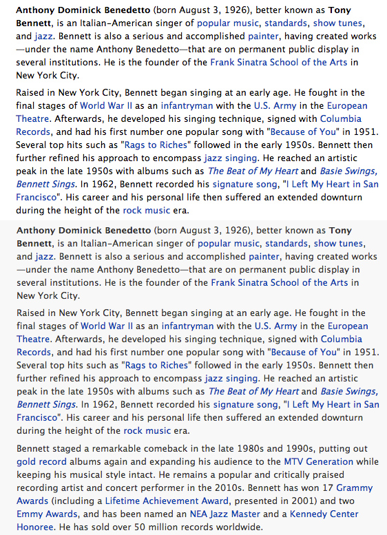 Contrast difference on WikiPedia typeset with Lucida Grande. Keep staring to see the difference.
Most of the web is text. And while we are fighting to improve everything, basics should not be forgotten. It is amazing how many big names, especially in publishing business hence close to typographic wisdom, have readability that doesn't even suck properly.
Line Height
Line-height can change your typography drastically. It's good to keep it in golden ration or between 1.5em to 1.6em. Why how what is a bit out of context. You can also use Pearsonified's Golden typography calculator.
More examples:
Here are some popular sites who could spend few more "minutes" on typography and improve their UX:
Wired Magazine & Other Publications

I like their content, but their typography sucks. You're from publishing industry for God's sake! But they are not alone, many publishers have typography on their websites that doesn't even suck properly. I adjusted the colors to low-contrast, shift to Lucida Grande and change line-height to 1.6em.
Quora

The only reason I don't visit Quora is bad typography. Yeah, I am that crazy! This is with Open Sans and 1.5em line-height.
I had Google+ here but they recently moved away from Arial.
Notes:
[1] Font availability stats from Wikipedia and [CSS Font Stack](http://cssfontstack.com/)