I was building new site this past weekend and I got into the liquid width versus static width debate with myself again. Now I’ve been involved in designing, programming, running, and optimizing websites in one way or another since 1998, and while I’m no usability expert I think I’ve seen and built enough websites to have a educated opinion, so I’d like to share what I think about how design and layout can effect your profitability.
First off lets look at some recent screen resolution statistics:
| Screen Resolution | 2004 | 2005 |
|---|---|---|
| 800×600 | 35% | 28% |
| 1024×768 | 50% | 56% |
| >1024 | 10% | 11% |
| smaller/unknown | 5% | 5% |
We see a reduction in 800×600 screens an increase in 1024 screen and a slight increase in larger screen (strangely 5% remain consistanly clueless). I’ll confess that I personally have a 17″ widescreen with a 1440 x 900 pixel resolution. I’ll also confess that at one point I would have defended liquid layout to death like a fiercely devoted open source zealot. The thing that changed my mind was actually getting a bigger monitor with a higher resolution. Why? Well unless you have LOTS of content, enough to fill the page at any almost any width your page just ends up looking … funny at some point. If you mix in adsense, affiliate links, or any other type of commerce where layout and placement are crucial, IMHO liquid layout makes a lot less sense. But lets take a look at some examples.
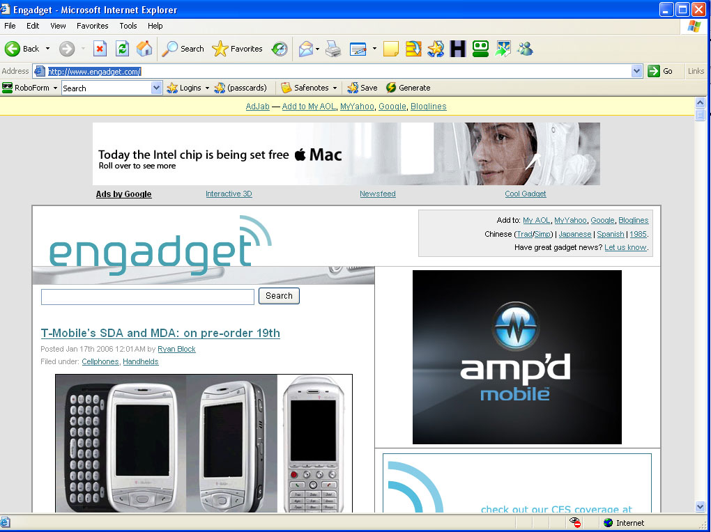
To start off lets look at the poster child for gadget blogs Engadget
A few thing to notice right off the bat I’ve only got one toolbar on so there’s not a lot of wasted browser chrome. Second thing to notice like all weblogs inc blogs it’s wider than 800 pixels (see the scrollbar on the bottom). As far as actual content we see the site masthead, the title of the first post, and thats it. Let’s raise the resolution up to 1024.
The horizontal scrolling is gone so IMHO that’s a good thing. Next thing is we are getting actual content on the screen. In this case it’s a picture but it could just as easily be text. Now lets look at it at at my my resolution of 1440.
Now even with the big picture we are still getting some actual copy. Now just because I’m a little crazy lets look at the same page in the RSS feed at 1024.
I feel there are two important things to take note of, one the advertisements are taking up much less screen real estate, and I can see almost two complete posts without scrolling. Why is this important to people who build and market websites? Hopefully you read the report that came out last week about how little time people spend evaluating a website. (Internet users quick to judge. 16/01/2006. ABC News Online)
“Visual appeal can be assessed within 50 milliseconds, suggesting that web designers have about 50 milliseconds to make a good impression,” the Canadians report in the journal Behaviour & Information Technology.
Associate Professor of psychology Bill von Hippel, from the University of New South Wales, says it takes about 50 milliseconds to read one word, making this a “stunningly remarkable” timeframe in which to process the complex stimuli on a website.
So if you are concerned with a websites financial success, exactly what and how much are you going to show that person in 50 milliseconds in an 800 or 1024 width screen? According to a recent article on blog design trends “big headers and footers are in” as well as “a thin border at the top”. From where I sit this doesn’t make much sense, you want to keep your masthead as small as possible, just enough to put a logo, establish branding, get some primary navigation, and maybe a search box. If you can do it in 50 to 75 pixels excellent, keep it 100 or less you’re still in good shape, approach the 150 pixel height and it maybe time to reign in your web designer, and see if you are on the same page and working towards the same goal. I’ve said it here a few times before, big huge tall banners have always been my problem with the layouts on CSS Zen Garden. Not that designs there aren’t stunningly beautiful, but I think they do more to stroke the ego of the designer on their 20″ apple monitor, than facilitate commerce on a 15″ to 17″ Compaq, Dell, or Gateway.
In Maximizing Profits With Website Design and Layout: Part II, I’ll give you some examples of what I think are design considerations you should think about.
Categories:( website.design, | website.design, | website.layout | website.layout)


