Comment added on: 18.05.2009 20:07:56
@ Guardian of the woods
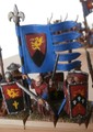
the damsel is very pale looking. no highligts real flat so i would say that a A+ is a way to high grade. she could be come a A+ with some highlights and a wash or two.
Comment added on: 26.10.2009 14:19:11
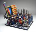
Damsel: It was from my early painting. Hair and the gem on the top of a pole is quite good (more advanced techniques), but rest could be better.
I am glad you like it anyway.
(She fell off the table this summer and woud need some repair.)
Guests are not allowed to post comments. Please register...
Send to Friend
Please login first...
Total pictures in all categories: 4.562
Total number of hits on all pictures: 4723575
Warhammer, Warmaster, Games Workshop (and more) are registered trademarks of Games Workshop Ltd. This site is not affiliated with Games Workshop Ltd. and no claim of ownership is made to any of these trademarks.
Design by Earl Cadfael and Guillaume le Courageux, responsible for the content (Admins) are: Etien de Rochefort, Guillaume le Courageux, Robert de Giselles (see "Staff").


Comments for this picture
very colorful, they look like went out from a Holliwood movie of the 80's.
But somehow so Bretonnian...
I really like the diversity of the shields! Adds so much character! bravo!
....and i know how you feel about not enough painting time
Top marks for the damsel, she is really well painted! A+
@ Guardian of the woods
the damsel is very pale looking. no highligts real flat so i would say that a A+ is a way to high grade. she could be come a A+ with some highlights and a wash or two.
Damsel: It was from my early painting. Hair and the gem on the top of a pole is quite good (more advanced techniques), but rest could be better.
I am glad you like it anyway.
(She fell off the table this summer